The kitchen is a multifunctional room where food is prepared, households, close friends and guests gather for tea. The kitchen combines various functions and usually serves as a dining room and living room. The zoning of the usable space allows the decorative wall decoration, which is often done with wallpaper.
In the article, we will talk about how to combine wallpaper in the kitchen, what advantages and disadvantages such a classic finishing option has, we will demonstrate modern design ideas in the photo and help to implement them on our own, with the least investment of time and money.
What does the combination of different types of wallpaper do in the kitchen?
It allows you to solve many interior problems, namely:
- Fix bad room geometry, "Raise" the low ceiling, "expand" the walls, add space and light to the kitchen. For this, horizontal or vertical combinations of wallpaper of different colors and textures are used.
- Emphasize the dignity of the room, to disguise rough places, for example, a ventilation box, which often spoils the overall appearance. Using combination, we manage to beat it beautifully, turn the problem into the basis of the design concept.
- Divide the usable space into work areas without using plasterboard partitions, sliding structures, arches, bar counters, which make the kitchen smaller.
- Emphasize attention on the surface of opposite or adjacent walls, and thus visually hide, for example, a not very new furniture set. In this way, it is possible to simply change the layout, allocate a working, dining area.
- Use the wall surface as a decorative piece of furniture. To do this, a small area is highlighted with a patch of colored wallpaper with a pattern, photo printing or other decoration. When it is large, it can be decorated with a baguette from a picture. From the outside it looks unusual, fashionable, stylish.
- Set the mood in the kitchen. So the interior, made in warm, calm shades in combination with bright wallpaper, makes a gloomy room more dynamic, fills it with a playful mood.
- Separate or, conversely, combine rooms in a studio apartment. This is a great solution when the kitchen is combined with the hallway or living room - it allows you to get a separate functional area.

We select a shade
Shades are cold and warm, they easily combine and set off each other. To figure out how they can be combined, you should familiarize yourself with important rules:
- cold tones: gray, blue, dark blue, green allow visually expand the space, give it restraint. They calm the human psyche after a hard day at work and have an invigorating effect in the morning. Such shades are also suitable for people who monitor weight, because they reduce appetite;

- small kitchens should be pasted over with wallpaper in light or pastel colors. But such a color scheme can inspire boredom - to revive it, it is enough to diversify the interior with several bright accents;

- when the kitchen has a high ceiling, the room is spacious and light, you can diversify the boring style solution with wallpaper of cold colors - for example, yellow or blue. White color is able to bring notes of calm nobility, luxury and chic into a living space. Silvery, gold tones always look modern and very respectable.

The interiors of modern kitchens are:
- Achromatic- they combine black, gray, white shades, which are usually diluted with bright accent spots or diametrically opposite patterns on the walls and ceiling.
- Chromatic- include four or more tonal, contrasting colors that complement or set off each other.
Important! Saturated tones can make the kitchen gloomy - single accents of bright color allow to visually correct the situation and unload the space.
To delimit the useful space, one part of it should be decorated with cheerful, bright wallpaper, the other with moderate, calm ones.

You can also combine contrasting shades of the same color, from the outside they look very interesting and unusual - for example: brown and beige, blue and light blue, burgundy and pale pink. It is appropriate to combine wallpaper with a textured, smooth surface - it looks incredibly creative and luxurious from the side.
Important! You should not combine wallpaper with large elements and variegated patterns, as this will irritate and interfere with food intake.
Choose a decorative coating carefully, it should:
- Become a background that sets off the furniture set from the general interior decoration.
- Enjoy a pleasant meal, improve appetite.
- Cheer up the owners, invigorate in the morning, relax in the evening.
All this can be easily realized by using a combination of wallpaper of various ornaments and shades in the kitchen. It is better not to combine a variety of styles, because from the outside, such a decoration looks ugly.
For classic styles it is better to select the same type of canvases of different colors, shades.
Contrasting, bright colors are suitable for young households; older people will like restrained, calm tones. When representatives of several age groups live in the same house or apartment, then calm tones can be diversified with rich, bright elements or accents.
In a spacious room, wallpaper can be glued both to the walls and the ceiling - decorative coatings look modern, stylish and original. Using color combinations, it is possible to raise or lower the vault, expand the room, highlight the arrangement of pieces of furniture relative to the walls.

Choosing the right drawing
In creating a harmonious, colorful interior, an important role is played by a pattern or decorative ornament applied to the wallpaper:
- it is appropriate to combine stripes of a similar color;
- you can combine wallpapers of different tones with floral prints - today this is the most popular design option;
- several different tones are well combined when a bright accent is inserted between them;
- abstraction and geometric patterns are perfectly combined, but this solution is more suitable for kitchen interiors made in the loft style;
- various tones of wallpaper with photo printing are also combined, but this requires special attention so as not to get oversaturation.

Criterias of choice
To choose the right wallpaper for the kitchen, you should initially decide:
- with their appearance, quality;
- colors, decoration, ornaments;
- combination with furniture;
- the area of the glued room;
- the number of rolls, the amount of money to buy.
Combination rules
- It is better not to combine new wallpapers with old ones, because the difference in color will be very noticeable.
- You should choose canvases of the same thickness so that the joint is not visible. When their thickness is different, care should be taken to accurately mask the irregularities. Decorative edging will come to the rescue.
- To obtain a harmonious kitchen interior, it is better to select canvases with elements similar in shape and color. The ideal solution is when similar patterns will be present on textiles or furniture.
- When it is planned to make a bright panel in the room, then it should be shaded with monochrome wallpaper with dim or small elements.
- Patterned sheets of natural wood look with floral patterns are wonderfully combined. And other imitations, for example, under a brick, look great with one-color stripes or ornaments.

Possible combinations
There are several types of wallpaper combinations. We will tell you in detail about each of them, we will demonstrate in the photo what appearance they have. So:
Vertical combining allows you to visually raise the low vault, expand the inner space of the room. For this method, narrow, wide strips are suitable, which can be placed vertically in relation to each other:
- asymmetrically- stripes of different widths are found in different corners of the room, give the interior dynamism, visually expand the space. This method of decoration is recognized as quite difficult to implement, because the tones used should naturally combine with each other. The classic combination is white with black, green, blue, yellow, etc. It is important that the tonal transition is smooth and soft;
- symmetrically- wall surfaces are covered with stripes from the center to both sides. This decorating method is a great solution for narrow, long kitchens. It is better to use polar shades for this.

When you need to create an illusionary play of light, you need to alternate stripes of the same color with different shades through one or two, which gives the room even more originality and mystery.
Horizontal combination great for tall and spacious kitchens, it can transform any interior, it has many options:
- the upper surface of the wall is pasted over with wallpaper with a large-sized pattern, the lower one is made one-color or covered with a small pattern;
- the top is made in a one-color, small pattern, the bottom is in a massive pattern;
- one-color top, bottom - striped;
- striped top, below - monochrome wallpaper or with a small pattern;
- the same color combination at the top and bottom;
- colors opposite in brightness above and below;
- different texture on top and bottom.

Important! Horizontal combination requires the use of additional materials: strips, convex molding, curb. They are selected taking into account the color of the trellises.
Making one of the walls in the kitchen accent, we draw everyone's attention to it. You can highlight both a niche near the table and a furniture set. The surface of such a wall is covered with colorful, bright wallpaper, and the adjacent surface is covered with canvases of calm, gentle tones.
However, you can place the necessary accents in another way - dilute bright, saturated colors with a large ornament of the same color or a wide white stripe. Quiet interior solutions can be decorated with photo wallpapers that can create contrast or be light and soft tones.

The accent wall allows you to:
- demarcate the kitchen by dividing the work and dining areas with a bright accent;
- focus on something specific, for example, a piece of furniture, a decorative element.
As an accent, small wallpaper inserts can also be used, which are glued to the wall at the final stage of the renovation, framed by a picture frame. A very popular today is the patchwork technique - "patchwork", which means combining small sheets of different shapes, colors, ornaments, shades into a single composition. This way of combining wallpaper is quite complicated, but the result is a rather interesting pattern.
The main thing that:
- individual pieces of wallpaper were in harmony in color;
- their texture and texture were different;
- the thickness is the same;
- the quality of the design was the best.
As you can see, combining wallpaper on the walls and ceiling is not just original, stylish, beautiful, but also practical and very convenient.

Combination in a small kitchen
Below we will tell you how to correctly combine wallpaper in a Khrushchev to create a cozy, comfortable atmosphere and original design, we will acquaint you with the advice of professionals.
The main advantages of combining several types of wallpaper in small kitchens are as follows:
- correct combination allows you to neatly hide any irregularities and defects on wall surfaces;
- visually expand or narrow the usable space (push apart the walls, raise the arch) and thereby eliminate the problem of disproportionate dimensions;
- divide the kitchen into zones - for cooking and eating;
- get an accent wall that allows you to demonstrate the design features of the room;
- create a stylish and dynamic interior.
Competent combination in a small room will allow you to beat the space and correctly solve the issue of the effective organization of functional zones.

Before pasting the kitchen in Khrushchev with combined wallpaper, we suggest that you familiarize yourself with the recommendations that will save you from common mistakes:
- In order for various canvases to be successfully combined with each other, it is better to select them of the same quality, price segment. They may differ in color, tone, texture, but all decorative designs and patterns must be in harmony with each other.
- In order not to get sloppy seams when joining, the material must be of the same thickness.
- When choosing wallpaper, it is important to take into account the general style, then it is possible to get a holistic, harmonious interior.
- Wallpaper with floral patterns is wonderfully combined with wood grain textures, abstraction is complemented by geometric shapes.
- Saturated tones combine well with warm, calm, without a pattern or with a little ornamentation.
Having decided to paste over the walls or ceiling of a small kitchen with one-color, decorative wallpaper, we recommend not to skimp on quality, reliability and practicality. Give preference to canvases on a vinyl, non-woven or fiberglass backing. An important consideration should be given to the color scheme, because the wrongly chosen gamut can introduce an imbalance into the interior solution.

Horizontal and vertical alignment
When the kitchen is small and the ceilings are too low, the optimal solution is a vertical combination of several types of wallpaper.
One-color canvases decorated with a small pattern look great from the side. To adjust the width and length of the room, we recommend sticking symmetrical, colorful stripes on opposite wall surfaces from the center.
If we use asymmetry (to paste over only one wall), then it is possible to visually expand the room and fill the interior with dynamism.
The combination of the horizontal type is appropriate in high kitchens. The classic way to delimit a space, to set it the right mood is to use wallpaper of different colors, textures, ornaments, but in the obligatory case, decorative elements combined with each other.
Division is most often performed in a ratio of 2: 1, the upper strip is made larger than the lower one, but there are other ways to decorate the walls:
- wallpaper with a large pattern is attached at the top, strips with a small pattern are attached below;
- the bottom with stripes or the top is made in the same color;
- one-color canvases are glued on top, a large drawing is on the bottom.
An extraordinary design solution is the use of a “horizon” in small-sized kitchens, which divides two different types of canvases.
The standard solution is to position the line flush with the windowsill.
When the ceilings are high, the wall can be decorated with two types of trellises in a ratio of 1: 3. In this case, the dividing line becomes a plank, decorative border, molding.

Playing on contrasts
Generally accepted rules:
- The main thing in this business is to choose the right shades. Classic solution- use for decorative wall decoration in white, black, light gray, golden, beige and silver tones. They look harmoniously with standard colors - they saturate pastel, light, overly dull colors, soften dark, saturated, bright ones. It is important not to go to extremes in this matter.
- The universal option is mix of black and white wallpaper, which allows you to visually expand the usable space, but you need to make sure that the light shade dominates over the dark one, otherwise you will not be able to achieve the desired effect.
- Combining different tones is appropriate when dividing a room into a work and eating area.
Playing with color
Not to miss in the choice of tones, to find the best option that can look original, beautiful, fashionable in the style of the kitchen, will help the study of the classic methods of connection described below.
One color - different texture
The optimal and unobtrusive option is to stick wallpaper on the walls with different textures, but of a similar color.
For example, one wall can be covered with trellises with drawings, and the rest with one-color.
Considerable attention should be paid to the selection of a suitable pattern and color - they determine the final result. A win-win solution would be pasting the walls with one-color canvases with horizontal or vertical wide stripes.
In order not to overload the interior, it is worth giving preference to tapestries with the same pattern and small size.

We focus on the zone
In a small kitchen, you can also create an accent zone that will hide the structural defects of the room, a protruding ventilation box.
If the low walls are glued with different wallpapers, then it is possible to turn the disadvantages of the interior solution into advantages. An interesting solution is to highlight one wall by pasting it with tapestries of different colors with an intricate pattern. For the best effect, you can choose the curtains in the same color.
For the basic design, it is worth choosing wallpaper of beige, white, light color, the accent wall should be performed in bright, saturated colors - light blue, lilac, red-orange, lemon.
Note that it is inappropriate to use dark colors in small kitchens, because they further narrow the space. The original solution is to use a wallpaper with pictures of falling water or a green forest with tall trees.

Decorative inserts
The use of several types of multi-colored cloths as patchwork inserts in modern kitchens is an incredibly interesting solution. The elements decorated in a picture frame look wonderful, which are combined in color, texture with the main color of the walls.
Using this technique, it is possible to create unique art objects, while successfully hiding various flaws in the room - recesses, bulging corners, etc.
As inserts, you can use multi-colored wallpaper with abstractions, floral patterns, geometric patterns, placed on a monochrome background.
It should be borne in mind that such a combination looks beautiful only with the presence of a sense of style. Patchwork technique rather complicated, it requires significant time expenditures, experience of working with a large number of different materials in the process of performing a single composition.

In order not to disfigure the existing design, wallpaper for combination must be selected competently and seriously.
Golden Rule: in order for the decor to turn out to be harmonious, at least one tone of the picture or pattern must necessarily be present on the accessories or the facade of the furniture set.
This also applies to the shape of some decorative elements, for example, ornaments, geometric patterns, etc. Only in this case, the interior decoration acquires balance, coherence.
The combination of canvases by pattern, color is also used to divide the space into a working and dining area. In one corner, dynamics is emphasized, in another - an atmosphere of home comfort and tranquility is created.
A variety of colors and textures on the walls can set the right mood for the room, organize several functional zones at once.
Subject wallpapers are combined with one-color; textured ones will be a great addition to smooth surfaces when the general style and palette of colors are observed.
It is advisable to buy everything in one store, or even better - from one manufacturer and one batch. If the materials need to be additionally purchased elsewhere, do not be upset - just take copies of the rolls purchased earlier. They can be applied to the surface of new wallpaper to determine color compatibility.
Professional craftsmen say: gluing tapestries of the same width and texture is much easier. Ideal when they are of the same brand... Note that some modern companies produce "companion wallpaper". Their price is more expensive than plain tapestries, but they greatly facilitate the process of pasting and eliminate the puzzle "fit or not" to a particular interior solution.

Designers are not advised to combine canvases of different styles of execution. The style of technique and classic, abstraction and baroque, hi-tech and Provence will definitely not look harmonious in a single space. Incorrect combination, visual inconsistencies in patterns will immediately catch the eye... What can not be said about the combination of decorative inserts, framed in picture frames, and a panel that will adorn any modern kitchen.
An equally interesting option for style framing is the accentuation of one of the walls of the room. In this case, it should not hide behind a furniture set; a table may be located next to it. The rest of the walls are covered with one-color wallpaper in a neutral tone, which favorably sets off the "main element".
A bright spot can be:
- color photo in the interior;
- poster;
- oil painting, etc.
Many modern designers do not welcome the combination of cheap and expensive canvases in one room, because such a mixture demonstrates, to a greater extent, the owner's bad taste.
Finishing materials should be selected at the same cost, otherwise the effect of elite tapestries will be completely lost due to patchwork inserts of simple plain wallpaper. Such "masterpieces" have to be completely redone.
When choosing a decorative coating for the walls and ceiling of the kitchen, it is important to remember that they must withstand sudden temperature fluctuations, high humidity and the aggressive effects of detergents. Ideally, when the drawing on the canvas is not very colorful, it contains no more than three shades.
Light, soft tones expand the space, dark ones narrow it. Black, brown, dark blue color of the ceiling will "press", and white, light blue - make the vault even higher. Do not combine cold, warm colors. The former are often chosen for rooms facing south, the latter - to the north.

Popular tricks
Professional designers use some secrets when decorating kitchen walls:
- "Polka dots", "stripes" are combined with retro style;
- geometric patterns will be a great addition to abstraction;
- large-sized drawing, decorative pattern should cover a large area of the wall;
- the ornament with elements of vegetation goes well with "stone", "natural wood structure", horizontal and vertical stripes;
- bright, rich colors need to be balanced with warm, bedding tones;
- the combination of wallpapers with different backgrounds, but the same print, is also welcomed.
There are a lot of nuances and highlights in combining different types of paintings. In each case, the choice is made individually, there are no typical schemes.
In the article, we described in detail how to properly combine wallpaper in the kitchen in order to organize a harmonious, interesting interior that fully corresponds to the tastes and aesthetic preferences of household members. Do not be afraid to experiment, give yourself completely to the extremely fun creative process, and you are guaranteed success.
Despite the variety of modern materials, wallpaper in the kitchen is not losing ground. This is a versatile, varied and beautiful finish - you just need to choose the right variety. But what if ordinary wallpapers seem too boring and monotonous? Do you want to add accents? Then feel free to combine different options, and we will tell you how to do it and what to look for!
Types of wallpaper for the kitchen
Not all wallpapers are suitable for kitchen walls, because you need to take into account humidity, temperature, fat and odors. For example, inexpensive paper collections, as well as expensive luxurious textiles, will not last even 5 years under such conditions. But there are alternatives!
Non-woven wallpaper
Non-woven is a more modern, practical and unpretentious substitute for paper. They are no less varied, and even more original in terms of textures. The fabric itself is denser and stronger due to the non-woven fibrous structure. Thanks to her, it remains environmentally friendly and breathable.
Non-woven wallpaper can be washed and repainted 10-15 times - the exact quantity for each collection is indicated by the manufacturer. Therefore, in order to freshen up the atmosphere in the kitchen, you don't even have to plan a major renovation. When laying non-woven fabric, it is enough to apply glue only to the wall - the canvas itself does not need to be impregnated. This means that it is much easier to stick it neatly and evenly, at the same time you do not need to worry about shrinkage when drying.

Vinyl wallpapers
Vinyl is denser, stronger and well hides small irregularities in the base, unlike paper. This is not a separate material, but a special foam coating that is applied to a paper or non-woven base. It is it that gives strength and durability, resistance to washing and repainting.
Vinyl is easy to work with - it does not bubble when gluing, so it is easier to handle on your own. You can wash the walls with a regular soft sponge and soapy water and not worry about preservation and color. And the specificity of the protective coating allows you to apply interesting textured patterns to the vinyl wallpaper using the silk-screening or cold stamping method.

Wallpaper for painting
Paintable wallpaper is a separate collection of vinyl and non-woven coverings with increased density and durability. Usually they are without patterns and drawings, but with embossed textures - in fact, this is an alternative to decorative plaster. Compared to paper, such wallpapers have increased sound and heat insulation, although, of course, they are not able to replace the cladding with mineral wool.
In the kitchen, wallpaper for painting is not afraid of any stains from grease, juices or wine. Even if you can't get it out without leaving a trace, the consequences of a minor accident can always be eliminated with a can of paint and a brush.

Glass fiber
Glass fiber is an unusual modern material of increased density and strength, which came to us from Europe. It is a durable looped fabric woven from fine fiberglass. In essence, it is closer to ordinary textiles, because it allows air to pass through and provides a comfortable microclimate.
You can even wash glass fiber with a hard sponge or brush, so it will not be difficult to remove the most difficult stains. When gluing, the seams are so invisible that you can replace a whole piece without leaving a trace. In combination with vinyl or non-woven, fiberglass wallpaper also gives an unusual play of textures.

Liquid wallpaper
Liquid wallpaper can hardly be called wallpaper in the classical sense - it is a kind of alternative to decorative plaster. Only instead of sand and other fillers, it contains lightweight and environmentally friendly cellulose. If you prefer the characteristic paper texture, then for a hot and humid kitchen, pay attention to liquid wallpaper.
With its specificity, the material combines well with others. Additives, pigments, mother-of-pearl, glitter and any other decorative impurities are introduced into it. You can experiment with textures and make the accent wall in the work or dining area no more neutral vinyl or non-woven backdrop.

Wallpaper
Wallpaper with photo printing is distinguished by the fact that absolutely any pattern can be applied to them, up to personal photos. There are different types of bases, so they can be used in the kitchen too. But most often this is an accent element, and not a full-fledged coating for all walls.

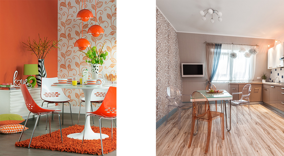
How to combine wallpaper in the kitchen?
When choosing wallpaper for a combination, pay attention to the color, texture, pattern, density and thickness of the coating. Use adjoining tones for monochrome interiors, and the principle of contrasts for accents. Combine single-color collections with patterned ones in the same range or similar patterns in different colors.
Companion wallpaper
If you want to combine several types of wallpaper in the interior, but you doubt the combinations and harmony, choose companion collections. They can be found in the assortment of most manufacturers and are already balanced in terms of technical, operational and aesthetic characteristics. Companion wallpapers will definitely not look too gaudy and lurid, but also not too boring.


How to combine wallpaper with a pattern?
The hardest part is to combine multiple wallpaper collections with expressive designs. Despite the eclectic fashion, you want to get a comfortable and cozy kitchen. Balance can be achieved by correctly balancing one with the other.
If your pattern is too large, keep the proportions and overall color scheme. If the pattern is small and of the same type, you can experiment with colors and arrangement. Be sure to control the brightness and saturation of the shades so that they are harmonious and do not visually reduce the room.
Monochrome wallpapers go well with almost any pattern. Romantic floral and plant motifs - with stripes or peas. The cell looks interesting with geometric ornaments, but follow the lines and accents - geometry most of all affects the perception of the room.


Solid and accent wallpaper combinations
Several collections with a difference of up to 3-4 shades create a fancy chiaroscuro effect. Use it for zoning, geometry correction, or visually expanding a space. It is a good choice for modern and minimalistic interiors, for pastel provence.
The reverse is a bright accent wall that immediately grabs attention. In this case, it is better not to overuse drawings and textures, but stop at one thing. Neutral and faded combinations will fit into minimalism and Scandinavian style, while bright and juicy ones will complement the loft, hi-tech, modern.


Combination with photo wallpaper
Juicy pictures and photographs can be appropriate in the kitchen like nowhere else. Even the brightest colors do not look too flashy and aggressive here, so do not deny yourself colorful accents. Choose wallpaper with a 3D effect or perspective to visually enlarge the room, or textured coatings to simulate any other material.


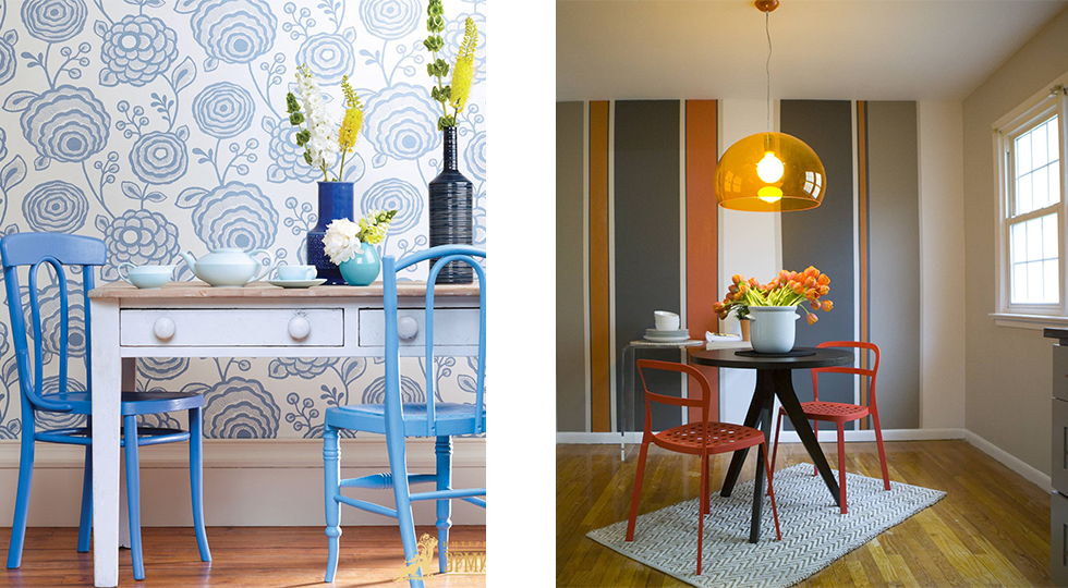
Vertical and horizontal combination
Vertical combining is a simpler and more obvious trick: you simply stick on different stripes in a different sequence. To do this, it is better to choose rolls from one manufacturer and from adjacent collections so that they match in width and thickness. Otherwise, the coating will be too patchy and sloppy.
Horizontal combining is much less common and much more difficult to do on your own. For example, the lower part of the wall is pasted over with wallpaper in small stripes, and the upper one - with plain or with a floral pattern. The seam is closed with an elegant decorative tape - an elegant solution for rustic and classic styles.


How to combine textures in the kitchen?
When choosing textured wallpaper for the kitchen, do not forget that they will inevitably have to be washed and cleaned from stains. Therefore, it is better to place the most complex and expressive reliefs away from the working area.
A monochromatic even coating with expressive accent inserts looks interesting. Experiment with a mix of matte, satin, glossy or glossy canvases. Combine ordinary wallpaper with plaster, brick, stone, wood or cork.


Niche decoration and wall panels
When combining different wallpaper collections, it is not necessary to cover all the walls with them. You can choose an accent collection for decorative compositions. For example, panels in massive baguette frames look no worse than posters or paintings, and at the same time emphasize the necessary areas - for example, a sofa or a dining table.
If you like expensive textile wallpapers with a pronounced texture, gilded threads and ornaments - use them as decorative inserts in a classic kitchen. The main thing is to place the composition away from the work surface, stove and sink.
Any niches and drywall structures will sparkle with new colors if you approach their decoration with imagination. In combination with textiles and other kitchen décor, you will add personality and expressiveness to the interior.


Wallpaper in the kitchen is not just a way to disguise boring bare walls, but a complete tool in the hands of an interior designer. With the help of wallpaper, you can create a very unusual, bright and memorable kitchen design, if you approach this issue correctly and creatively. Today, it is not necessary to simply paste over all the walls in the kitchen with one type of wallpaper - in the modern perception it looks rather boring.
A new trend in interior design is the combination of wallpaper in the kitchen in various ways. By combining different colors, shades, textures, patterns on the kitchen walls, you can get a very stylish and sophisticated look.
In the understanding of many people, especially the older generation, the idea of combining several types of wallpaper in color and pattern seems unusual, but it is worth your attention.
Having seen several unusual and original combination ideas, you can easily light up and come up with your own options for combining wallpaper in the kitchen. The main thing is to adhere to several basic rules for combining colors, zoning and a combination of textures and types of material.
The main thing is to choose a harmonious combination and pay attention to accents.
Basic rules for combining
All ideas that you can find on the net or in interior design magazines can be repeated exactly, or you can just use a fresh idea and adopt the principle of combination. Today there are no strict dogmas and laws in design, and each apartment owner can decide for himself how to decorate the interior with wallpaper.
But you should still remember a few important rules:
- pay attention to the main parameters of the room - size, side of light, illumination, presence / absence of zones dividing the room, and choose a solution in accordance with the basic physical characteristics of the room;
- combine materials similar in type and price, do not combine expensive vinyl with cheap paper - it looks frankly tasteless;
- do not overdo it with a set of colors - it is better to use two, maximum three primary colors, otherwise the kitchen will look oversaturated, and your design idea will be difficult to understand;
- proceed from the style and color scheme of the kitchen and choose wallpaper that match in color and shade with the flooring, furniture, appliances, tiles in the work area.
When we combine wallpaper in the kitchen, many of us find it difficult to adhere to the golden mean between the desire to be unusual and original and the ability to stop in choosing a color, texture and pattern. But it is better to always opt for restraint, especially if this is your first experience of independent kitchen interior decoration.
The main methods of combining
Many interesting combinations can be found in home decoration magazines. Despite the abundance of ideas, they are all based on several basic principles of combination:
- accent wall decoration;
- symmetrical and asymmetrical color combinations;
- a combination of plain wallpaper and a pattern;
- vertical and horizontal combination;
- zoning of the room using wallpapers of different colors, textures and patterns.
You can adopt one of the basic principles, relying also on the physical parameters of the kitchen, described above. It is important that the combination of wallpaper in the kitchen does not worsen the visual impression of the design of the room, does not emphasize the shortcomings and weaknesses of the layout, make the decoration of the room original and at the same time functional and justified.
Room size
For small and large rooms, different principles are used for choosing colors and textures, combining shades with each other.
For example, large and airy kitchens can give virtually unlimited freedom in color and pattern choices. But for a small room, it is advisable to choose suitable materials that visually expand the area of the room.
Ideal in this regard are light wallpapers with a slight shimmer, which make the kitchen visually more voluminous and spacious. The same applies to rooms with low ceilings.
It is advisable to choose light - white, sand, beige, cream with a vertical stripe, which will visually increase the height of the walls. It is better to stick them on the wall on which the light from the window falls - so the room will seem larger and more spacious.
Use accents to visually change your kitchen layout
Side of the world
Light level is another important parameter to consider when choosing wallpaper for a combination. Naturally, the combination of wallpaper in the kitchen on the north side involves the use of brighter and lighter shades (yellow, white, sand), and on the south and east side of the apartment, you need to choose calm and balanced tones.
They look universally - harmonious light green, light green, yolk, lemon, as well as gray, metallic, pearl, pearl shades.
Features of the layout
Before combining wallpaper in the kitchen, it is also important to evaluate the features of its layout device. Zoning a room with different colors and textures is a great option, especially for a studio layout.
In the working area, you can use dark colors - blue, purple, and in the dining area - brighter and lighter - yellow, orange. The bay window itself asks to use a different type of wallpaper than in the rest.
And if the dining table is located near the front wall, then it can be accentuated by gluing bright ones with a pattern, and the rest of the walls can be made in a calm pastel tone.
Examples of combining wallpaper
To get a successful design using a combination of materials on the walls, it is enough to buy two types of material. Depending on the idea, it can be plain and patterned, color and monochrome wallpapers, photo wallpapers with a macro photograph, panoramic photos.
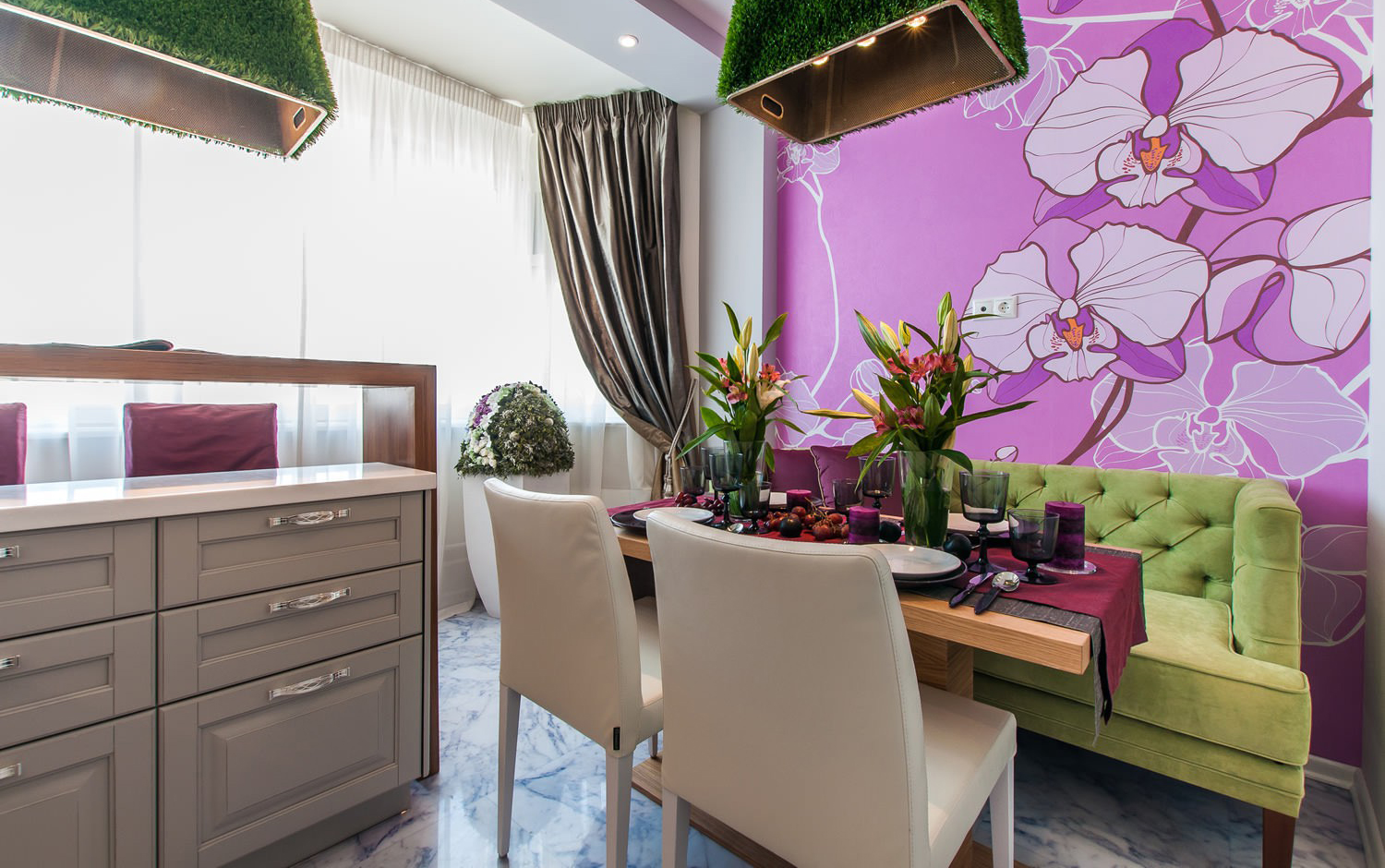
Accent wall decoration
This is the most popular and versatile way to combine two wallpapers in a kitchen. If there is a relatively small wall less than 5 meters wide, then it can be used as an accent by pasting bright and colored, patterned, textured ones.
The rest of the walls are decorated in a neutral key - using simple muted shades without attracting attention to drawings and details.
You can decorate an accent wall like this:
- choose bright wallpaper with a pattern, variegated (in this case, the main color should be in harmony with the rest of the interior elements);
- choose plain colors without a pattern, but bright and saturated colors, combining them with calm wallpapers in the same or contrasting colors.
The second option can look very stylish and complete, especially if you choose wallpapers of the same brand and series, but in different colors. For example, after making the accent wall bright yellow, take wallpaper from the same manufacturer, but light lemon, banana, yolk and other less bright shades of yellow.
You can also go according to the principle of contrast, using materials of different colors. But this must be done carefully, because the contrast of colors in the interior requires a very balanced approach.
An example of an accent wall in the kitchen
A good example is a purple accent wall and light yellow wallpaper on other walls, or orange on a background of light green walls. It is easier and more convenient to choose options for combining wallpaper in the kitchen using computer modeling tools
Symmetrical and asymmetrical combinations
There is another popular way to combine wallpaper in the kitchen - use different types, sticking them on the walls in different ways - with symmetry and asymmetry. For example, with the help of wallpapers of different colors, you can create shapes on the wall - squares, rectangles, sticking them along the edges of the walls.
You can simply make wallpaper for the kitchen in the form of stripes of various widths, combining shades of the same tone, one-color wallpaper and a pattern. Asymmetry gives the room visually additional square meters.
Combination of plain wallpaper and patterned materials
This way of how to combine wallpaper in the kitchen echoes the accent of one wall and asymmetry, but in an expanded form. A great idea is to stick one type of wallpaper symmetrically on the corner walls, and on the contrary (in another corner) - another. You can decorate the adjoining walls of the kitchen with different wallpapers in color and pattern, which will look very sophisticated.
The contrast principle can also be used effectively in this case. Stick one wall with bright orange wallpaper, adjoining it with peach wallpaper with a pattern (floral, vegetable, geometric), and on the contrary, with plain blue, as well as light blue with a similar pattern. This is a very stylish solution that your guests will surely appreciate.
An example of a plain wallpaper with a pattern and vertical stripes
Vertical and horizontal combination
Another interesting way to combine wallpaper in the kitchen is to place them horizontally or vertically on the same wall. Such a solution will look original if you choose the right wallpaper in color, pattern and texture, and also do not forget about the homogeneity of the material and the general price category.
Horizontal zoning is an excellent choice for a kitchen with high ceilings, which helps to balance and visually make the room more compact. Most often, designers choose an asymmetrical horizontal combination of wallpaper for the kitchen, placing one type of wallpaper at the height of the window sill, and the other on the rest of the wall.
It is better to make the lower part of a darker shade, which allows you to achieve a feeling of harmony and stability on a subconscious level (the base in the lower part should always be darker). The options for materials for horizontal combination in the kitchen in the choice of wallpaper can be different:
- the lower part is with a pattern, the upper part is monochromatic;
- the lower part is monochromatic, the upper part is with a pattern;
- two parts are monophonic, the lower one is darker, the upper one is lighter in general or contrasting colors.
There is a variant of using wallpaper similar in color and even tone on the upper and lower parts of the horizontal, with the difference that on one of the parts the wallpaper will be textured, with a small pattern, embossing and other decorative elements.
Vertical combination can also be asymmetrical and symmetrical, contrasting and in the same color scheme. The narrow stripe in the outer part of the wall, combined with a wide part of a different color, looks very unusual. You can emphasize it with a picture of the color of another part of the wallpaper, a clock, a shelf and other accessory.
And the option of wallpaper in the kitchen in a symmetrical layout is an even bolder option that requires careful thought through the arrangement of furniture. After all, if a sofa, table, picture or wardrobe will go beyond one color of wallpaper to another, then it will be a real "hell for a perfectionist", causing latent irritation in the viewer.
Zoning a room using wallpapers of different colors, textures and patterns
Zoning a kitchen with wallpaper is a common solution in interior design. Depending on the selected zone in the kitchen, wallpapers, you can choose completely different in style, color, texture, observing only the price category, so as not to get a tasteless design. Most of the space for creativity will be in the spacious kitchen, where there is a work and dining area, as well as a place to relax.
In the working area, you can use simple wallpaper without a pattern, or geometry, floral motifs and ornaments. In the dining area, you can decorate a wall using a macro shot (juicy fruit, foliage, flower). In the recreation area, you can use retro-style wallpaper, a red brick pattern to simulate a loft-style wall, an oriental ornament, and other options. The main thing is to adhere to the general color scheme and not overdo it with the number of colors, especially contrasting ones.
How not to combine
Many people, carried away by creativity and a wide field for creativity, make many mistakes and mistakes when combining wallpaper in the apartment and in the kitchen. The most common ones are:
- a combination of incongruous shades (for example, red and green, blue and yellow);
- combining two patterns of different style (for example, geometric abstraction with floral patterns);
- style conflict (for example, urban-style New York wallpaper and rose-colored retro wallpaper);
- too many different patterns and textures (some use more than three types of patterns - a cage, peas, a flower), which looks too colorful and interferes with concentration;
- a combination of materials of different price categories - this has already been mentioned as bad taste.
If you do not know how to correctly combine colors and patterns, then use the universal principles:
- by color: red - with pale pink, white, gray; orange and yellow - with brown, ocher, terracotta; green - with light green, emerald, lime; blue - with blue, light lilac, light purple;
- geometric shapes (squares, triangles, circles) - with an abstract background (large stripes, lines, but not flowers);
- floral motifs - with ornate patterns, monograms, with plain wallpaper;
- photo wallpaper - with a single color neutral shade;
- macro photo - also with solid colors (for example, the image of the veins of a green leaf must be combined with light green or green wallpaper);
- vintage or retro (strip, polka dots, checkerboard - with plain wallpaper of the prevailing color in the picture).
Conclusion
By adhering to these simple rules, you can avoid many mistakes and make the right choice when combining wallpapers of different colors and patterns. But this does not mean that you are limited in creativity.
Instead, you can practice using computer simulations to get a visual idea of what your kitchen will look like after a facelift.
Combining wallpaper in the kitchen is not only an original way of decorating the walls, but also a great opportunity to divide a room into functional zones and correct the not-so-good geometry of the room: “raise” low ceilings, “push” the walls, add light and space. Sometimes just one bright design solution is enough for the kitchen interior to completely transform and sparkle with new colors. The combination of wallpaper of different textures and colors is one of the most affordable and simple ways to decorate the interior of the kitchen.
Combining wallpaper in the kitchen is one of the most common design methods.
What is good about combining wallpaper in the kitchen
- It allows you to hide layout flaws and wall defects: too high or low ceilings, a small area, a disproportionate ratio of the width and length of the room.
- With the help of combination, it is easy and convenient to divide the room into functional zones, which is especially important for studio layouts. The visual separation of the working and dining area will be appropriate even in a small kitchen.
- By correctly combining wallpaper in adjacent rooms, you can visually combine them, while maintaining the individuality and independence of each individually.
- Perfectly dilutes the monotony of the situation, giving the interior of the kitchen dynamics.
- Allows you to visually highlight one of the walls of the kitchen, making it accent.
- Combination techniques make it possible to draw attention to the zest of the kitchen layout: bay windows, niches, columns, etc.

The rules for combining wallpaper in the interior of the kitchen are simple and effective.
Basic rules for combining wallpaper in the interior of the kitchen
- You should not combine luxury and cheap wallpapers. Best of all, wallpapers of the same quality and price category are combined, differing in color and texture: matte and glossy, smooth and rough.
- For combination, it is advisable to select wallpaper of the same thickness, which will avoid problems with joining and selection of edging.
- The chosen option for combining wallpaper should be in harmony with the style of the kitchen, and also fully reflect the specifics and purpose of this room.
- To avoid kitsch and create the most harmonious atmosphere in the kitchen, try to choose wallpaper with overlapping design elements: a single style of ornament, different shades of the same color.
- It is recommended to balance bright large-format panels with plain wallpaper or wallpaper with a small discreet pattern.
- Floral designs go well with woody patterns and textures.
- Geometric motifs are perfectly combined with abstractions.
- It is recommended to combine active saturated colors with muted neutrals.

The combination of two similar colors in the interior is considered a win-win option for the kitchen.
Design techniques for combining wallpaper in the kitchen
- Vertical striping
Combining wallpaper by alternating vertical stripes will help "raise" an overhanging ceiling or make a too narrow and elongated kitchen more proportional. A similar layout is quite common in old panel houses.
Options for vertical division of the wall with wallpaper:
- Symmetrical - on both sides in the center of the room we paste over the walls with wide bright stripes of wallpaper. Contrasting colors are perfect for this role. This simple design trick creates an interesting optical illusion: the length of the room will appear equal to the width of the stripes, which will help to visually balance the proportions of the length and width of the kitchen.
- Asymmetrical - one of the walls, as in the previous version, is pasted over in the center with a wide bright strip of wallpaper, while bright stripes of different widths are glued in the far corner of the opposite wall. This technique will help not only visually shorten and expand a too long and narrow room, but also give dynamics to the interior of the kitchen.

Vertical alternation of plain stripes and stripes with a pattern can visually expand the space and increase the height of the room
Vertical combination of wallpaper in the kitchen is a great way to avoid monotony in a monochrome interior by alternating stripes of different shades of the same color one after one or one after two. The gradation of shades will visually be perceived as a whimsical play of shadows.
With contrasting combinations, you should be more careful so that they do not turn out to be too aggressive and intrusive. If the combination of green with crimson or red and blue seems too daring for you, it is better to stop at the classic contrasts: black-white, black-red, golden-blue.

In another interior, this insert might seem boring and inappropriate, in this one, on the contrary, it introduces a frivolous note
If the kitchen design provides for the presence of two contrasting walls, vertical alternation of wallpaper on one of the adjacent walls will help "erase" the sharp edge, creating a smooth transition.
Horizontal division of walls
In rooms with high ceilings, professional decorators often resort to the classic technique of decorating and visual transformation of space - dividing the walls horizontally. Two to three alternating horizontal stripes balance the vertical plane. This technique works great in all styles. A favorite design trick is to combine cork or wood panels with regular paint or wallpaper. However, the simplest and most universal way of horizontal division of walls is to alternate strips of wallpaper that differ in color, texture or ornament, but certainly overlap with each other in one design element or another. It is customary to divide the height of the wall in a ratio of 1: 2, and the width of the lower strip is predominantly inferior to the upper one, and not vice versa, although other options are possible.

Dividing the walls horizontally with a border is a very effective decorative technique for creating a luxurious interior.
Classic combinations of horizontal wallpaper combinations:
- The bottom is in a small pattern or monophonic, the top is wallpaper with monograms, large flowers, or striped.
- Striped bottom with a solid color top, or with a small pattern.
- Bottom with large floral patterns or monograms, complemented by a solid top or vice versa.

A solid color wallpaper on top and a matching wallpaper with a simple pattern on the bottom, separated by a theme border, looks cute and attractive
The binding of the "horizon" to the height of the window sill will help to significantly facilitate the work. The lower part, two-thirds the height of the room, will be appropriate for very high ceilings. For combination, you can use both wallpapers of similar shades and contrasting ones. This technique works great with different textures of the wallpaper. For example, after finishing the bottom with embossed vinyl wallpaper that looks like plaster, the top can be made softer and warmer with textile or cork wallpaper. At the joints, a border, molding or dividing strip is placed as a decorative line.
- Accent wall
Recently, in the interior design of kitchens, it has become fashionable to make just one of the walls of a room bright and elegant. An accent wall is a great solution for those who love bright colors. However, before deciding on such a bold and daring step, you should carefully weigh the pros and cons. By highlighting one of the walls with bright wallpaper, you risk introducing an imbalance in the composition of the room, and it will be perceived skewed. To restore balance and correct proportions, using furniture and decor elements that match the color of the accent wall near the opposite wall will help.

To revive the achromatic interior, you can use an accent wall with wallpaper in a different color.
As a rule, to decorate the accent wall, wallpapers of bright saturated colors are used, which create a certain mood in the room, having a powerful effect on the emotional and mental state. That is why the selection of a color or its shade for an accent wall should be approached with special scrupulousness. Do not forget that in the created environment you will have to work and live.

Bright photomurals have become a real highlight of this restrained and elegant light interior
If the kitchen is too elongated in length (a kind of "tram effect"), this flaw in the layout can be corrected by turning the far wall into an accent one. Contrasting with the background or just a more intense tone will visually "bring it closer", thereby visually shortening the length of the room.

A black wall with unusual stylish patterns makes a completely standard interior unique and inimitable
Creating an accent wall is a great way to dilute the monotony of an achromatic or monochrome kitchen, zone a space, or simply draw attention to an interesting object or interior composition, such as a fireplace or a painting.
- Emphasis on architectural highlights
Instead of hiding and masking all sorts of niches and protrusions, try to go the opposite way - highlight them with wallpaper that differs in color or texture from the background, thereby turning them into spicy architectural highlights. By pasting over niches or ledges with wallpaper in contrasting shades, you can create very original interior accents and make the kitchen sparkle with new colors.

Against the background of variegated walls, a white semi-column or other detail of the layout will successfully perform the function of zoning the room
The decoration of niches and ledges with wallpaper that matches the color of the kitchen set will contribute to the creation of a harmonious atmosphere. Against the background of a snow-white wall, a black-gray, bright red niche or wallpaper of any other rich color will look great, a peach or yellow ledge will perfectly complement the sky-blue wall, while a light green or green color will become a spicy addition for a pink room ...

The emphasis on architectural highlights in this interior allows you to achieve an interesting decorative effect.
Even if the room is devoid of any architectural features, highlighting a separate part of the smooth wall with contrasting wallpaper, you can:
- Wallpaper inserts: wallpaper as an art object
Decorating the kitchen interior with wallpaper inserts involves working on top of existing finishes, i.e. the walls of the room must be previously covered with wallpaper or painted. There is absolutely nothing complicated in this combination technique. It is advisable to make inserts from thick massive wallpaper, preferably on a non-woven basis. The inserts are selected in various sizes and shapes; they can either contrast with the general background of the walls, or echo with it in color, texture or ornament.

Wallpaper inserts: wallpaper as an art object looks appropriate and attractive in this interior, and, covering the walls completely, would look clumsy and annoying
Bright blotches with floral prints, monograms, geometric shapes, abstractions or thematic kitchen and gastronomic motifs look most advantageous against a plain background. For classic interiors, framing of inserts with borders, moldings or planks is characteristic. The Baroque style assumes the presence of square or rectangular frame structures. Complex geometric shapes will become an organic addition to neoclassicism and avant-garde.
- Wallpaper patchwork: patchwork combination
A very unusual way to decorate the walls of the kitchen is a patchwork combination of wallpaper or the so-called wallpaper patchwork. Remember the colorful quilts? Something similar can be implemented on the walls of the kitchen. This option will certainly appeal to those who find it difficult to choose one sample of wallpaper from the richest assortment on the market.

Patchwork combining wallpaper in the kitchen is a task that can be accomplished by an experienced designer or a person with an innate sense of style and proportion.
Despite all its colorful playfulness and childish naivety, the patchwork combination technique is one of the most difficult. Firstly, in the case of a patchwork, you will have to work not with large canvases of wallpaper, but with "patches", which will take much more time and require a lot of patience. Secondly, you need to be able to choose materials that can be combined into a harmonious integral composition, and not a kitsch “miracle with feathers and a bow on the side,” although perhaps this miracle will become your hobbyhorse, who knows. Taking risks is a noble business, but if you are not confident in your design genius, it is better to act with confidence: choose materials that go together with each other.

Patchwork from wallpaper in the interior of the kitchen can become the main decorative element.
To avoid purely technical problems with pasting and joining, choose wallpaper of the same type, for example, vinyl on a paper backing. It will be great if the wallpaper comes from the same collection with overlapping motives. "Patchwork" can be multi-colored, the main thing is that they are united by texture, pattern or ornament. Wallpaper of different shades of the same color and texture will be perfectly combined, for example, purple, lilac, lilac and eggplant.
Photo options for combining kitchen wallpaper

Luxurious embossed wallpaper with exquisite patterns looks even more respectable on a simple light background

The accent wall in the kitchen's interior, located in the dining area, attracts the attention of guests in the calm atmosphere of this kitchen

Bulky wallpaper inserts give this spacious, simple kitchen a more attractive look.

An accent wall in a contrasting kitchen serves not only as a background for the dining area, but also as an important decorative element.

In this cute and cozy rustic kitchen, the focus is on the layout details.

Combining wallpaper in a classic interior usually involves the use of a single color scheme.

Using different styles of wallpaper in one room allows you to get an interesting and effective result.

Using photo wallpaper with a non-trivial plot is a great opportunity to create a unique interior in the kitchen

A common interior design method is alternating vertical stripes.

Stylish bright wallpaper in the dining area will create a good mood and give vigor for the whole day

In the interior, stylized as a rustic, an unusual version of the horizontal division of the walls was used

The combination of lighter wallpaper at the top and darker at the bottom usually blends harmoniously with the interior.

An accent wall with a macro image in the interior of the kitchen always looks unusual and stylish

Contrasting wallpaper with an interesting pattern can easily cope with the role of a decorative element of the interior

The contrasting black and white wall in this kitchen brings out the vibrancy and cheerfulness of the yellow kitchen unit.

An interesting option for decorating the kitchen with wallpaper with a different background color and the same pattern

In order to fully appreciate the decorative effect of this wallpaper, you need both space and proper lighting.

A simple drawing on a light background does not require special conditions, it goes well with any plain wallpaper

Unusual wallpapers with a complex and beautiful pattern will fully reveal their decorative possibilities only in an appropriate setting.

An accent wall that echoes the color of the kitchen unit is a great backdrop in this kitchen.

A win-win option for the kitchen is the choice of beige or brown colors as the basis of the interior

This kitchen uses the standard horizontal dividing technique, but a darker color is chosen for the upper part of the walls.

The same pattern on a different background creates an unusual visual effect

In a bright and spacious kitchen, contrasting inserts look the best possible.
Repairing a small kitchen is not an easy task. It is necessary to select materials that will visually make the room larger, while maintaining a sense of comfort. In addition, it is important to take into account that the operating conditions in the kitchen are far from ideal - constant moisture, temperature drops, steam and condensation. In a small room, all this is felt more strongly than in a spacious one.
Choosing wallpaper for a small kitchen requires a thoughtful approach.It is especially difficult to find the right decoration for the walls. Many people mistakenly believe that wallpaper for a small kitchen is not the best choice. However, if done correctly, wallpaper will be an excellent material, both aesthetically and functionally.
 The right wallpaper can visually change a room.
Wallpaper material for kitchen walls
The first thing you should pay attention to when choosing a material for finishing a kitchen is its performance characteristics. The coating should withstand temperature extremes and humidity well. When it comes to wallpaper, it is imperative that you can clean up the dirt. Therefore, we recommend that you pay attention: even if food particles or drops of grease get on them, you can easily remove the stain with a sponge and detergent.

Wallpaper made of paper is not the most reliable option for use in the kitchen. Most of these coatings are not particularly resistant to either mechanical or thermal damage. They can only be used as a decorative insert in kitchens with combined walls: for example, paper wallpaper over the dining table and tiles around the kitchen perimeter.


When choosing paper wallpapers, pay attention to their relief: most often such a coating cannot be washed. Therefore, it is better to leave too complex, textured wallpaper for other rooms - they will quickly acquire an untidy, greasy look.
 Pay attention to the markings: wallpaper must be resistant to heat and moisture
 Therefore, give preference to flat paper, without protrusions and textured patterns.
It is much more convenient to use non-woven wallpaper in the kitchen. They look much more interesting than ordinary paper ones: outwardly, their texture resembles. Unusual relief, patterns, the ability to repaint at any time. In addition, they can be washed without harsh abrasive products.

They are more expensive than paper ones, but they are much more durable - if you do not violate the operating conditions, they will last you about ten years. Plus, you can update your repairs regularly.
Another significant bonus is the ability to paste over the wall above the stove and sink. True, for this you need to choose paint with the appropriate marks - moisture resistant and non-flammable.
 Such wallpaper can be used over the entire area.
 An even more reliable option is vinyl wallpaper. Durable and reliable, they are easy to clean and can even be used with abrasive products. This makes them ideal for use even in the dirtiest areas of the kitchen - next to the stove. True, the cost of such wallpaper is quite high. However, it is fully justified: they are very strong and durable.

In addition, a wide design range allows you to choose wallpaper for any interior design. Plain, patterned, 3D printed ...


Which palette is ideal for a miniature room
The peculiarity of arranging small rooms is that it is extremely important to choose the right color scheme. Otherwise, you can reduce the already tiny area.
 Give preference to light, natural tones
 First of all, you will have to give up dark colors: they visually reduce the area, especially in a matte texture. Your choice is light, pastel colors. Or, on the contrary, bright colors - if you balance them correctly, they can become a real decoration of a small kitchen.

The correct selection of color can visually make the kitchen more spacious, even in, so we recommend not to neglect these recommendations.
Clean is also not a good idea for a miniature room. First of all, you will be uncomfortable in it. In addition, paradoxically, such a technique visually only makes the room smaller. But you can dilute white with bright accents - this will immediately create a feeling of light and spaciousness.
 White walls definitely need accents
 If you want a monochromatic interior, give preference to slightly richer tones - light beige, ivory, baked milk.
 Pastel shades are perfect here.


Black and other dark shades may also be present, but should not dominate. For example, such tones can be used as a pattern on wallpaper or tiles - subtle and unobtrusive. They will emphasize the depth of the light shade and make the room more elegant.
 Dark tones can be a good accent
 In small kitchens, excessive variegation should be avoided: two, maximum three shades. Do not try to combine several self-sufficient shades at once - it is better to leave such solutions for spacious rooms.
 There shouldn't be many bright colors
 In general, monochrome, solid surfaces are much more suitable. As for patterns and prints, they should be discussed separately.
Using pictures
It should be admitted that not everyone likes monochromatic surfaces. Sometimes you want to add colors, decorate the room with any pattern or print. It is more difficult to do this in a small kitchen than in a large one. However, if you approach the matter with caution, then everything is real. The main thing is to use common sense and not try to put several painted surfaces at once in the same room.
 Prints and wallpaper should be used with care.

First of all, let's talk about patterns. Here one should adhere to the spirit. Large, bright and massive paintings are not your option. Better to focus on fine lines, graceful designs. It is better to give preference to tones that contrast to the background - this way the surface will receive volume and make the kitchen visually larger.
 Choose graceful patterns
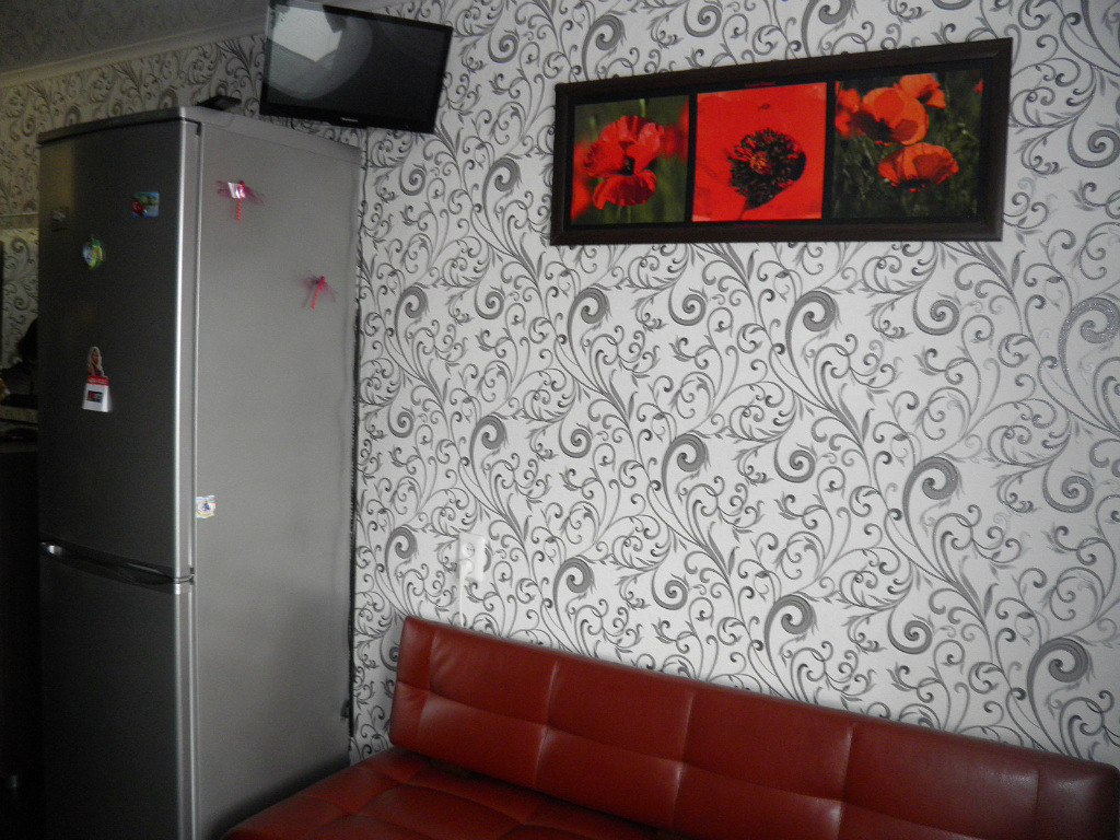

And remember, the patterns should not be applied throughout the kitchen - it is better to use them as an accent. For example, leave three walls monochrome, and decorate the one above the dining room with a beautiful pattern. Alternatively, you can decorate an apron in this way.
 Do not overdo it
 It is not necessary to use abstraction. In a small kitchen, fruit, floral, coffee motifs look very appropriate - use everything that is related to food. Many vinyl wallpapers are adorned with beautiful 3D prints. It can be an image of cherries, lemons, apples - any fruit. Therefore, choose the ones that you like and that are in harmony with the color scheme of your kitchen.
 Fruit in the kitchen is always on topic.
 The main thing is not to overdo it. If you decorate all the walls in this way, you will not get, but a semblance of a fruit shop - this is hardly the effect you are planning to achieve.
Wallpaper with the image of coffee beans or silhouettes of coffee cups looks good. In our opinion, it is better to combine them with other coatings in beige and light brown tones. This will create a cozy atmosphere. This solution is ideal for country style or cafe.

Floral wallpapers are also noteworthy. However, remember that it is extremely important to pay attention to their quality: if the print is indistinct, the impression will immediately deteriorate and the repair will not seem too fresh.


Bright accented wallpaper with ornaments in a small kitchen should be used with the utmost care. If you overdo it with their number, you risk visually greatly enlarging the room. Do not glue them on all walls at once. Add a little colorful accent - this will achieve an original look and avoid the effect of congestion. It is best to place this wallpaper over or opposite the dining table.
 Wall murals must be glued to a maximum of one wall
 Important: Discard large ornamentation. It will make the room heavier, which is unacceptable for a small kitchen.
Classic striped and checked wallpaper will suit almost any type of interior - inside and out. The main thing is to choose the right colors. However, all elements should not be too bulky - small cage, thin stripes. Keep in mind that in this design, the cage of contrasting colors will ripple - this can be too tired for the eyes. Therefore, use soft, pastel shades or trim only a small part of the wall this way.
 Geometric shapes are appropriate in any interior.
 Vertical stripes will visually make the kitchen taller and horizontal stripes wider. Therefore, think carefully about the effect you plan to achieve.


Brickwork is not the most trivial solution for a small kitchen. It is better to choose a wallpaper that imitates not too large bricks in light colors. However, the classic terracotta shade also looks very beautiful if you play it right - for example, stick it in combination with white walls.
 Brick should be used carefully
 3D printed wallpapers and wall murals can give your kitchen a stunning look. It is important, however, to choose the right drawing. For example, a city view or a landscape of decent quality greatly expands the kitchen.
 The print should be in harmony with the interior.

But abstract prints or complex, multi-component paintings, on the contrary, visually clutter up the room. Glue such wallpaper on one wall - otherwise the effect will be far from what was intended.
A method of combining different colors
Most likely, you have noticed that we often suggest using some type of wallpaper on only one wall or even part of it. A similar method of combining wallpaper of different colors and textures can play into your hands if you want to visually enlarge a small kitchen.
 It is important to harmoniously combine colors
 However, there are some subtleties here:
- In small rooms, a combination of shades similar in color segment looks best - smooth transitions expand the space.
- Avoid using more than three primary colors in the interior. In a small kitchen, such a technique is unacceptable.
- Avoid the dominance of dark shades - they will diminish your kitchen.
- Make sure that all shades belong to the same heat segment: do not mix cold tones with warm ones and vice versa.
Besides color combinations, you can experiment with combinations of different materials. However, remember that too embossed wall textures are not the best choice for a small kitchen. You will get tired of wiping dust and dirt off of them. In addition, the space will be visually smaller.


Ways to visually increase the space
Choosing the right wallpaper for a small kitchen will help you significantly increase the space, at least visually. Use our ideas or write your own in the comments!
The easiest way is to stick light wallpaper with a glossy texture. Due to their reflective functions, such walls seem to move slightly apart from each other.
 Plain light wallpaper will make the kitchen look bigger
 Use prints wisely - for example, wall murals with city views and landscapes look good on a free wall. However, it is extremely important that the drawing is of high quality, otherwise the effect will be smeared.
 Print can expand the room
 You can hang mirrored wallpaper on one of the walls. They are not only some of the trendiest, but also significantly enlarge the room. True, there is one serious drawback - most likely, you will have to wipe them regularly, since any dirt is noticeable on the mirror surface.
Use patterns on the wallpaper: vertical lines and ornaments will raise the ceiling, and horizontal lines will visually expand the room. This technique is very good if the room seems disproportionate.
 Work with patterns
 Try to choose not too bright colors for the patterns - this will make the space seem more airy, which means that the kitchen will look larger than it really is.
A very unusual idea that deserves attention - wallpaper with a print ... of a kitchen! A high-quality drawing that visually extends the room looks great, and the kitchen seems to be twice as large.
 Experiment with prints
 True, to implement such an idea, you will have to seriously spend money - you will have to make wallpaper to order, and the drawing must exactly correspond to the real picture. Therefore, get ready to shell out not a small amount.
By the way, such an idea is a godsend for not too neat housewives. If the drawn half of the kitchen is in perfect order, then the real one will have to be carefully monitored, otherwise the contrast will seem too striking.
What to look for when buying
Whatever wallpaper you choose, you should carefully consider the buying process itself.
 It is very important to choose high quality wallpaper.
 - Above all, remember that good building materials are rarely cheap. Explore the range of online retailers and read our article for good brands. Are you offered something much cheaper? Most likely, the wallpaper will fall off in the first month or the colors will lose their saturation.
- Do not buy wallpaper in markets and dubious stores. Storage conditions are not always observed there, which means that you run the risk of purchasing damp goods.
- Take measurements carefully before buying and be sure to take a roll in reserve. No matter how carefully you glue the wallpaper, there is always a risk of ruining something in the process.
- Have you decided to buy embossed wallpaper? Carefully inspect each roll: scuffs, scratches may appear not only during use, but also due to a factory defect. It will be difficult to exchange such a roll.
- Study the characteristics carefully. Not every coating is suitable for use in a kitchen environment.
As you can see, there is nothing difficult in choosing wallpaper for a small kitchen. And in order to better decide on the choice of wallpaper for a small kitchen, we suggest that you look at real photo examples.