Have you started renovating and are deciding what to paint the room with? Remember that the color scheme of wall paints should not be left aside. Be sure to take this aspect into account while working.
Color is a powerful tool and accentuates architectural details.
Take a look at Newton's wheel: you can gravitate towards either the cool spectrum (blue, turquoise) or the warm spectrum (red, orange).
Orange and yellow solutions visually bring the space closer to the eye. This makes the room smaller. Warm color palette colors are used as an accent in a long narrow room. Painting the end part with orange and red shades creates balance.

Herbal, blue, violet solutions move space away from the human eye, which are made from small room big. On an end or side interior partition, this technique will make it possible to turn a narrow room into a wide one, and from a small one into a large one.

Color selection
Shops and markets offer a wide range of dyes. How to choose the color of the walls in the apartment?
- Consider the existing items, put them together to make the right decision. Floor coverings, artwork, carpets, upholstery will tell you the right option. If your home is unfurnished, choose a color last.
- Take samples home. The wall paint you see on the counter will look different under the lighting in your home.
- Do not view the sample against a white background. Color is affected by its surroundings, so placing a swatch on a white background will cause it to appear darker than it actually is. Many people define too light a tone this way. The sample should be viewed against the background of the sofa, floor covering, wooden furniture, flooring.
- Take into account how the palette flows. If the house is dominated by an open plan, then choose one color scheme throughout the entire floor, adding bright accents to the desired areas.
Related article: The nuances of wallpapering paint
The following tips will help you get rid of unnecessary waste of time and money.

Style solutions
There are trends that have been around for a long time: blue and white kitchens or calming green bedrooms. However, new ideas are also interesting. They are worth paying attention to.

Calm style
You can settle on one color, for example, blue - it calms the psyche. This looks good in the bathroom or bedroom, anywhere you need to relax. Curtains, towels, bedding, accessories may be different.

Blues, lavender, carnation and soft lemon colors are a great option for a romantic atmosphere. A calm atmosphere will be created by pastel shades of warm, cold, neutral milky. Use different textures bedding, accessories to make the environment even more attractive.
Sage, buttery golden shades will make the kitchen cozy. Choosing a wall paint color from subtle blue combinations will create a peaceful home.
Elegant style
Neutral options will create an elegant mood. This is not only a beige and milky option. An ordinary bedroom will become elegant with almond finishing patterns. Add color to pillows and vases to offset neutral tones. Don't be afraid to add structure to your accessories. Neutral wall paint colors will allow you to play with the atmosphere of your home and make it visually wider.
Various patterns of rust, mahogany or garnet will create an earthy, rich feeling.

Bright style
If you want fun, then when choosing the color of the walls in your apartment, use bright combinations and their shades - such as orange and gold, red and dark purple. The nearby colors of the circle are complemented by the opposite ones on the wheel: gold and orange with purple. Red and black are chosen to create a contrast to the oriental style.

Choose two opposite circle combinations: they will play against each other. The style completely depends on your taste, it should be matched to the atmosphere.
On video: how to make your living room bright and sunny.
Ceilings
Visually lowering the high ceiling is a tone that is darker than the rest of the space.

If you make the ceiling lighter, you can expand the room. If you are afraid to overdo it with the ceiling palette, use ivory notes. This will add elegance, a smooth transition from one shade to another.
Related article: What is fiberglass and does it need to be puttied?
Interior partitions
Perfect interior partition The one that creates emphasis is the one that is guaranteed to attract attention. If you can’t decide, then consult with your friends. Use one that won't be hidden or boring. A balanced design involves the correct placement of furniture near the accent partition. Huge closet or long curtains should not obscure it.
You can’t leave the space next to it empty, otherwise it will look unbalanced.

A different palette of paints for walls will create a certain state. Once you find one you like, limit your choices to no more than two combinations.
Colors and their meaning in design
Brown
The cozy, rich dark brown color will make you curl up and fall asleep. It creates an atmosphere of forest and magic. Sunny brown will take on the most unusual shapes at different times of the day.
Brown will look perfect with rich orange or muted pink.

Red
Red increases energy levels at home. This shade is quite intense. Choosing this wall paint color is intuitive and personal.

Purple increases blood pressure, breathing rate, and heart rate.

Yellow
Yellow notes capture happiness and are associated with sunlight. This is an excellent option for the kitchen, dining room, and bathroom, where this color will give you good health. In the hall, small corners, yellow will look welcoming.

Lemon coloring a space is quite cheerful, but is not recommended for the main scheme. A large amount of yellow creates a feeling of disappointment and anger.

Orange
Orange is used to create excitement and enthusiasm. It looks great in the gym, where you need to release anger and negative emotions.

Violet
Combination purple shades always the richest, but at the same time quite sophisticated. As an accent, it gives depth to the scheme.

Tones of milky lilac and lavender create peace without a feeling of cold.

Green
Green is the best soothing color for the eyes. The colors combine from refreshing blue, invigorating golden, delicate light green: they suit any corner of the house.
Related article: Why do you need a RAL paint palette and what shades does it include?

In the kitchen, this shade cools down and promotes unity and harmony.

Blue
Blue colors reduce the number of heartbeats, are considered relaxing, and are recommended for bedrooms and bathrooms. The pastel palette of the house is milky blue and can highlight the warm notes of furniture and fabrics. In living rooms and large kitchens we select bright blues and azure.

Blue is used as a main color scheme with dilution; too much of it can cause a feeling of sadness.

Neutral
Neutral tones, such as beige, milky, gray, black, are basic for the decorator.

They go out of fashion and come back again; their advantage lies in their versatility and flexibility. Black is rarely used, mainly as an accent. Experts believe that black is essential in every corner of the home. This shade adds depth to the setting.
Do you want to feel romantic and calm? A light warm or cool palette will help with this. How to choose a wall paint color to bring peace and a cozy atmosphere? Make the room buttery, golden - like the kitchen. Need to feel calm and balanced? Make everything out of notes of moss and sage. What if your energy and bright personality are overflowing? Transform with rich colors.
How to understand the atmosphere of elegance and serenity? Choose neutral shades of color for the walls, such as cool grassy.

You don't have to spend a lot of money to remodel. appearance your house. With a little pigment and a lot of imagination, you can easily change everything using the right combination colors for painting the surface. You can feel the way you want with the help of a brush and imagination, because choosing the color of the walls is not such a difficult task.
Color combinations in the interior (2 videos)
Variety of colors in the interior (35 photos)


You can completely update the look of your home. However, it is not at all necessary to do complete renovation— just change the textiles in the rooms: curtains, sofa cushions, rugs. This is especially easy to do if the color of the walls in your apartment is neutral - white, gray or beige. If the walls or furniture (or both) are bright, active colors, you will have to put more effort into creating a harmonious palette.
Let's look at each of the colors separately. What are the good things and what are the disadvantages? Where is it better to apply this or that shade in the interior of a home?
White color in the interior
White is associated with purity and freshness. It reflects light rays, increasing the illumination of the room and thereby visually expanding the space. Therefore, white color is a lifesaver for small rooms where there is little light, for example in a bathroom or in a room on the north side.
The only drawback of white (as, indeed, of all light colors) is its staining. Therefore, if you are not ready to take your carpet to the dry cleaner every six months, it’s better not to buy it!
Black color in the interior
If you really love black, then designers recommend combining it with mirror surface- for example, use shiny panels or glossy tiles in the decoration. By absorbing light, it reduces space.
Grey colour in the interior
A wonderful background for expensive interior items. Gray is calm and neutral, but individually it is a little boring, so you shouldn’t make it dominant in the interior of the room. But a gray background, especially in light colors, is an excellent solution for those who like changes in the interior. After all, you can add a variety of color spots in warm tones to it, thereby completely changing the appearance of your home.
Red color in the interior
As a main color it is too active. Yes, it is associated with wealth, luxury and beauty. If you choose the right shades, you can perfectly decorate the hall, living room or kitchen. (Red, by the way, increases appetite.) Use it carefully in the nursery and bedroom, as the color scheme of these rooms should be soothing. If the interior is designed in cool colors, then a little red in the decoration will give it coziness.
Be careful with the color red in a room where older people live: this color has the ability to increase blood pressure.
Yellow color in the interior
If the room is located on the north side, then this is an excellent option. Yellow stimulates the process of cognition and develops intelligence, so it is also good for a children's room. On yellow wall Stencil painting looks great, and a funny drawing can make your baby very happy.
Orange color in the interior
No less active than red. You should not decorate the walls of the room in bright orange color - very soon you will get so tired of them that you will have to do an unplanned redecorating. But in addition to other, calmer tones - why not? This color encourages communication, creates a trusting atmosphere and promotes the harmonization of relationships. Use it in areas where family gathers most often, such as the living room or dining room.
Brown color in the interior
Neutral color, but its light tones are more pleasing to the eye than dark ones.
Brown color in the interior is best suited for furniture. Noble classic! Beige, peach and coffee with milk colors go well with it, especially if you complement the design with darker details.
Blue color in the interior
Designers love to use soft blues and cyan shades in bedroom decoration: this color relaxes and creates a feeling of peace. Visually, light shades of blue can make a space appear larger, which is why designers often choose them to decorate small spaces.
But in the kitchen, a dominant color in the form of blue or cyan is undesirable: these colors reduce appetite.
Purple in the interior
The most mysterious color. It has many shades that affect people very differently.
There is one thing general rule for purple: in living spaces it is better to use light tones, since too dark shades of this color are tiring.
Green color in the interior
This natural color is good for the eyes and soul, it is associated with warmth, summer walks through the forest or garden. But you should know that shades of green can be both warm and cold, and this creates a completely different mood! It is believed that the color green helps to concentrate attention, so it is often used in the design of a study room and a children's room. Some designers consider pistachio and light green colors best for bedroom decoration.
But you should be careful when choosing accessories for this color: experts say that green color goes best with shades of... green.
➣ Useful advice. It is not advisable to use more than five colors in the interior of a room.
The principle of color compatibility
Color combination - a whole science. To simplify your life, you need to remember the main thing: bright, rich colors goes well with black, white and grey. That is, if you want a bright detail in the interior, use a neutral background for it.
Another win-win option is to combine related colors. Combine different shades of the same color: for example, brown - from beige to chocolate. In a green interior, the color range can be from swamp greens to the color of young lettuce.
Dynamics of contrasts
If you like to experiment, then you will definitely be interested in color contrasts. It is believed that they make the interior dynamic and give it some tension.
Classics of the genre" - White and black. To remove the touch of tradition and formality, enliven these “chess” with some bright, vibrant color. For example, sunny color curtains.
White color goes well with blue and red. The patriotic tricolor is a very stylish color unity.
Grey gorgeous in company with pale lilac, violet and crimson.
Friends of blue- yellow, sand and orange.
Yellow irresistible with green, blue and purple.
An interesting color contrast - dark green with brown and beige.
Very ladylike
Mirror, dressing table, a banquette or an ottoman - that's all you need to organize your personal area in the bedroom. This, in fact, can already be considered a boudoir - a ladies' office.
If there is a lot of space, it is better to replace the mirror with a trellis and complement the “boudoir” with an armchair and a floor lamp. In the trellis you will be able to see your beloved from all sides, and with the help of a chair and additional lighting get another vacation spot.
In addition, the ladies' corner will add a little aristocratic chic to your home.
With windows facing north
If the room faces north and there is almost no light in it, then use white or very light wallpaper to decorate it.
A palette of yellow, soft orange or beige-pink is suitable here. Designers advise: using pastel colors, try to include bright splashes of color in this range. Let's say add orange to sand or white. Or red - pure and deep.
The floor should also be light. Parquet is preferably golden yellow, with shine.
If linoleum, choose something very light - cream, light yellow, with a carpet or marble pattern.
Do you prefer carpet? A coating of frankly hot colors will be “on theme” - check out juicy orange, dark red, burgundy brown, brick red colors.
And the furniture should preferably be light. And in no large quantities so as not to clutter up the space.
Lighting in such a room must be organized in such a way that the light is distributed evenly. That is, a single central chandelier is not suitable here. Light up your room with small wall sconces - even in daytime. It’s good if these are matte white balls: the light will be soft and natural.
Or use lighting along the upper perimeter of the room (the same option when it is hidden under ceiling plinth and small lamps are aimed at the ceiling).
Another option is a lamp with a fabric lampshade. Choose a warm-colored fabric (shades of orange, red, yellow) - it will add coziness.
How to arrange furniture correctly
There are five main types of color combinations upholstered furniture, wallpaper and things indoors.
Monochrome. The sofa in such a room has the same color as the walls, but has a different shade. For example, these options: the walls are pale blue, and the sofa is blue. Or the wallpaper is beige and the furniture is brown.
Neutral. Both the walls and the sofa have a neutral, but different color scheme. For example, you can put a gray sofa against beige walls, and a black one against white walls.
Neutral sofa and colored interior. If the walls are colored and bright enough, the restrained colors of the sofa will allow you to maintain balance. Neutral sofas are white, black, gray and various shades of beige. Such sofas will fit into any interior color.
Colored sofa and neutral interior. Here everything is the other way around. A colorful sofa becomes the only bright accent in a “colorless” interior. For example, a room can be painted in white and gray tones, and only a red sofa will dilute this color silence. The color of the sofa in the interior can also be supported by other things: match the colors of curtains, lamp shades or floor vases.
Combined. This is an interior for the most daring, a colorful sofa in in this case is introduced into a room of a different color. This is the case when, for example, there can be a blue sofa against the background of red walls, and an orange one against the background of green walls.
The main companions of the sofa are soft chairs. Their union can also be interestingly played out with the help of color.
Accent. The sofa is neutral, and the armchairs are bright. The walls of the room are usually also neutral. If, for example, the walls are beige, you can put a sand sofa, and next to it - red, green or blue armchairs. This combination looks impressive.
Neutral. Neutral-colored armchairs complement a sofa in another neutral color. For example, the sofa is black and the chairs are white.
Neutral armchairs and colored sofa. Unlike the first option, here the sofa has bright upholstery, and the armchairs have neutral upholstery. This combination is chosen so that the furniture does not seem tacky. If you add the same armchairs to a bright large sofa, you may end up with too much color. Neutral chairs allow you to avoid this.
Multicolored. In a neutral interior, there may be bright accents of not one, but two colors: one of these accents will be a sofa, and the other will be an armchair. For example, in a gray living room, the sofa may be green and the armchairs yellow.
How to visually make a long room square
Space zoning. Using a floor covering such as laminate different colors or a combination of different coatings, you can “break up” a long room.
Furnishings. There is no need to place furniture along the walls. This makes the room look even longer. Try to zone the room with furniture by installing a shelving unit or a small sofa perpendicular to the wall, but so that you can move freely around the room.
Wall and ceiling decor. The walls and ceiling in such rooms should be painted in light colors.
Textile. Long, floor-length curtains on a cornice fixed just under the ceiling will make the room shorter and the ceiling higher.
Lighting. A traditional chandelier in the center of the ceiling is not suitable here. Use local lighting different zones using floor lamps, sconces, table lamps.
How to choose the color of fabric for curtains
Which one to choose - plain or printed? It seems like you want it with a pattern, but won’t you get tired of it in a week or two? Natural or synthetic? It seems like you want cotton or linen, but washing and ironing...
Designers draw your attention primarily to plain fabrics.
Pros:
they increase the space of the room, while printed fabrics (especially with large patterns) narrow it;
It’s easier to choose accessories for them (for example, tiebacks) and other decorative items (pillows, napkins, blankets);
they are more economical (there is no need to join the pattern, which means less fabric is required).
Regarding curtain material, best choice There will be a mixed fabric that contains natural fibers and is the most practical to care for.
Windows: light and color
A correctly selected color scheme for window decoration will help visually expand the space, make the room more comfortable and bright, or, conversely, cope with excess sunlight.
It's easiest to stop at neutral shades curtains (sand, cream or beige), which are always in fashion. In this case, it will be quite easy to change the style and mood of the room without changing the curtains.
Decorating windows with curtains of neutral, restrained shades will suit adult, solid interiors (bedrooms, living rooms), and experiments with more bright colors- children's and youth rooms.
If you want to draw attention to the window and take your eyes off other, less successful components of your interior, choose bright curtains: preferably not plain, but striped, checkered or printed. Combine with these
bright curtains and other interior components: make a tablecloth, napkins, covers for decorative items from the same fabric sofa cushions, floor lamp shade, etc. Or buy other accessories of the same color and with the same pattern as the curtains.
If the interior contains a large number of colors, you can rest your eyes by choosing not very bright, plain curtains to match the color of all the walls or just one wall (if a combination of shades was used in the decoration).
And if you want to create monochrome interior, made in one color, it is not necessary to choose curtains whose shade exactly matches the shade of the walls and bedspreads, furniture upholstery and other textiles. Choose curtains that are not identical, but similar in color, or choose two-tone curtains so that the window stands out rather than blends in.
Color design plays an important role in a modern interior. The wall color is much more important than arrangement furniture or design of individual items in the room. At the same time, the walls are easy to repaint or wallpaper, and furniture is bought to last for several years...
Wall color combinations in the interior
Sometimes colors don't go together at first glance. By combining warm shades with cold ones, you can achieve interesting effects. Contrast causes colors to enhance each other. Strong contrasts should be avoided in small rooms, since this way we optically reduce them.

How do wall colors affect the psyche?


- White color creates a feeling of spaciousness, but if there is a lot of white color, then the room will be boring and uncomfortable.

- Red - revitalizes, activates, excites the senses.

- Yellow - tones, strengthens the nervous system, gives strength.

- Blue - calms, increases concentration.

- Green - puts you in a lyrical mood.

- Orange - restores, warms, awakens the vital forces of the body.

- Violet - inspires, calms nerves, promotes mental work.

Wall color - test painting is required!
The same paint looks different on different surfaces: on a smooth surface it looks lighter, on a rough surface it looks darker, on a matte surface it looks warm, on a polished surface it looks cooler. If you are not completely sure of the chosen color, paint a small fragment of the wall as a test.
Tired of walls of the same color? Take a contrasting color of paint and paint one wall with it. This simple change will make your interior look summery!

The color of the walls does not have to be a calm background for the interior. It is becoming increasingly fashionable to paint one wall in such a way that it is different from the rest - for example, it would be a contrasting color.
The contrasting technique of painting walls has many advantages. You will give the room the new kind, saving time and money. And if you get tired of the color, you can quickly change it to another.

Adjusting the size of the room using the color of the walls
By choosing the right color, you can visually adjust the proportions of the rooms - expand, narrow, make it higher or lower and highlight zones.
Long rooms can be shortened optically by painting a shorter wall with dark paint; Small rooms can be enlarged by using light pastel colors, and to add intimacy and comfort, choose dark, rich shades.

The color of the walls, or rather their painting, helps to hide the imperfections of the wall, masking unevenness, cracks and stains. Paints in soft, desaturated shades are best suited for this. When choosing a color, consider the intensity of sunlight.
Intense shades are better suited for rooms facing east or south, while light shades are better for rooms facing north. Do not forget that not only the walls are important, but also the floor, furniture and other interior details: they must form a color unity.

Consider the texture of the wall. Textured plaster makes the wall color darker. This effect can be explained by the fact that an uneven surface darkens the shades and creates a grayish shadow.

The final color will be revealed after drying.
The saturation and shade of a larger range of paints will appear only after complete drying. Even under ideal conditions, water-soluble paint dries within 5 hours. However, it is better to wait a few days to ensure the final result.

White wall color
White is a universal background and goes well with other colors. If it has dominated your apartment so far, feel free to “dilute” it with all the colors of the bright palette!

Pink wall color
By skillfully using paints, you can simulate the architecture of an apartment - for example, elongated room divided into zones (dining room and relaxation area). It is enough to paint one of the walls with a bright color.
If you have a large room, in which light shades predominate, do not be afraid to use rich colors, which in combination with neutral ones will give an excellent effect.
Wall color compatibility: combine cream carpeting and light furniture with a fuchsia wall. Choose accessories in the same colors to complement the interior.

Orange wall color
Harmony is achieved through colors of equal intensity. Their skillful combination organizes the space: in wide room it seems that a wall painted orange brings the distant part of the room closer.
Wall color compatibility: a rich orange wall color will go well with green floor covering or carpet. For this composition you can choose elements of yellow-green, white or cream shades.

Blue wall color
This color scheme will create an atmosphere of peace and relaxation. Cool colors, such as blue and gray tones, which have a calming effect on the nervous system, balance thoughts and feelings, and induce sleep.
Wall color compatibility: if you sleep in a bright room with large window To paint one wall (for example, the headboard of a bed), choose a rich blue color that matches well with the blues and grays of the rest of the walls and floor.

Spicy wall color
If you want to create a truly exotic project in warm colors, we recommend using bright colors oriental spices. Soft, unobtrusive tones of turmeric, spicy cinnamon and cardamom create a wonderful combination in a room that is reminiscent of the interiors of North African homes.
Wall color compatibility: the spice palette can be varied with many other subtle tones.

Earthy wall color
Earthy tones echo the natural colors of our environment and can be safely combined and mixed. They are often successful due to their naturalness and softness.
Wall color combination: warmth textured wood combines with muted tones of brown and sand, which in turn create a natural, soothing color that is pleasing to the eye.

Elegant warm wall color
The warm, soft tone of the plastered walls - milky, baked milk, soft pink - will definitely be an excellent starting point when decorating the living room.
Wall color compatibility: a great combination with a dark blue curtain and a chair in an elegant tan color will look better than ever!

Neutral color
The most reliable and widespread is the use of pastel desaturated shades. If there is already some kind of decoration or furniture in the room, be guided by their shade. If the tiles or carpet in the room are not colored, neutral tones will look great on the walls in the room.


Decoration of wall colors in the interior. Photo


Anton Tsugunov
Reading time: 6 minutes
So, the issue of repair was on the agenda. It doesn’t matter whether we are talking about a newly purchased apartment in a new building or updating the interior of a family nest that has become boring over the years. How to make your home cozy and comfortable? What color should I paint the walls of my apartment? Should you choose one color scheme for all rooms or is it better to diversify the design of the rooms as much as possible? Let's try to answer these questions.
Options for color compositions
The idea of a common color scheme in an apartment does not require using only one color in all rooms. Color solutions for finishing can be:
- monochromatic (one primary color combined with several shades);
- polar (using only two contrasting tones);
- two-color (two colors that go well together are used);
- multicolor (a combination of three or more colors).
The whole point of a single color scheme is not to limit the number of shades used, but to ensure that in each room the selected combination is at least approximately duplicated.
Let's look at examples:
- If you choose one specific color, for example green, each room will be decorated in shades of green, and in one room the walls may be olive, in another light green, in a third emerald.
- With a polar color scheme, such as a combination of blue and yellow, the selected combination is used in every room. For example, the walls in all rooms can be painted in yellow, and decorative items and furniture are selected in blue shades. It will be interesting if one room is blue with yellow elements, and the second is yellow with blue accessories.
- A two-color or multi-color color scheme in this case does not mean using different colors in rooms, but repeating a certain combination in each room. For example, you like the combination of brown, green and white. Then this color scheme will be visible in the kitchen, bedroom, and living room.
When painting walls or wallpapering in rooms for recreation or mental work, it is better to choose colors without sharp contrasts and variegation.
Features of different colors
When deciding what color to paint the walls, you should think about psychological characteristics colors, as well as their “behavior” in the interior.
- Black is not usually used as a primary color, but can be part of the overall color scheme. It goes well with mirror and glossy surfaces, but at the same time absorbs light and narrows the space around.
- Gray color is neutral. Well suited as a background for expensive furnishings. Gray color in the interior is suitable for those who often change the appearance of the premises. It is easy to select interior items of other shades, but if not approached correctly, it can look gloomy and boring.
If the walls of the apartment are painted in one neutral, discreet color, to change the color scheme of the interior it will be enough to change the accessories: curtains, upholstery, pillows on the sofas.
- White color in the interior receives increased attention from designers. Associated with the sun, purity. Indispensable for small rooms that need to be visually enlarged. White color in the interior has only one drawback - increased contamination.
- The color red has many shades, the correct selection of which allows you to effectively decorate your living room or kitchen. For example, the coral color in the interior clearly screams luxury and wealth, while cool shades of red give the room coziness. However, you need to remember that it quickly causes fatigue and complicates the situation, so using red as the main color of the apartment is not the best solution.
- Yellow and orange colors have a positive impact on a person. Ideal for children's rooms and rooms facing north. They may well become the basis of the overall range.
- Blue is a very popular color among designers when it comes to painting bedroom walls. It has a relaxing effect and creates the illusion of peace, but it’s worth considering whether it’s worth making the whole apartment blue. Light blue shades are used for visual expansion small rooms.
- One of the most controversial colors in the range is purple. It has many shades, each of which has a different effect on the human psyche. When exposed to a lilac shade for a long time, it reduces activity and depresses. Purple color is rarely used in the living room interior, because it visually reduces space and contributes to fatigue. If you love purple, use it in combination with other colors, such as white or green.
- Brown color, in particular its dark shades, also visually narrows the room. But unlike purple or lilac, brown Designers often use it for their ideas. It creates a calm and unfussy mood, calms, and goes well with most colors.
- Green color helps to concentrate attention and has a positive effect on performance. Painting the entire apartment in different shades of green can be considered a completely acceptable option.
If you find it difficult to choose a color or are afraid that the chosen shade will quickly get boring, stop at white or beige. White color in the interior is universal.
Style features of color design
Each direction in interior design tends to use certain shades of colors.
- Classicism gravitates towards light pastel colors.
- The selection of shades is retro and allows for any contrasts. The most incredible combinations are possible: pink and green, purple and orange.
- Minimalism implies a light palette using white, gray and black tones, symbolizing restraint and laconicism.
- – a range of brown and golden shades with transition into each other. Combinations of cream and butter colors are also possible.
- Mediterranean style - selection of shades of green (pistachio, emerald, olive), white, blue, blue, amber and terracotta colors.
Rules for selecting a general color scheme for decorating an apartment
When choosing color design It is worth considering the following nuances:
- It is necessary to select the general color plan of the apartment, taking into account its light orientation and natural illumination. If most of the windows face south and east, cool colors will do. In rooms located on the north side, it is better to use the warm part of the color scheme.
Warm colors create comfort and coziness in the room, while cold colors demonstrate restraint and respectability.
- A general rule for interior design: the darkest shades of the main color should be located at the bottom, the lighter shades should be at the level of human eyes. The lightest ones are under the ceiling, which is done in neutral colors.
- A very popular option is to paint one wall of the room in more saturated colors, and the rest in calm and muted colors.
If the goal is to focus attention on certain furnishings (for example, paintings, tapestries, antique furniture), it is worth choosing more restrained tones for the walls.
When deciding what color to paint the walls in different rooms of a house or apartment, you need to take into account many nuances and rules. Following the existing recommendations will allow you to get an attractive and harmonious room that will not cause discomfort. When choosing a shade, you should pay attention not only to classic, traditional solutions, but also evaluate the options offered by the teachings of Feng Shui.
All colors are conditionally divided into three categories:
- Cold. This group includes violet, green, blue, blue gamma. Suitable for brightly lit rooms located on the south side.
- Warm. Includes a yellow, red, orange palette. Are great solution for the north side with insufficient natural light.
- Neutral. Traditional grey, white and black shades.

Each option has a specific impact on a person’s emotional and mental state. Some tones can cause aggression and anxiety, while others, on the contrary, relax, put you in a calm mood, or promote creative and business growth.
Secrets of successful choice
When choosing a color scheme, individual preferences are of primary importance. But to make such an important decision, you can use recommendations that allow you to more accurately assess all the nuances.
General rules:
- Purpose of the premises. Each room in an apartment or house most often has certain functions, which influences the interior design and the color of paint for the walls. An example would be a bedroom, which should set you up for a good rest. The presence of black, variegated or brightly alternating shades in such a room will not give harmony. Even in one-room apartment the space is divided into zones.
- Surface texture. At finishing works The general design of the interior is determined in advance, so it is immediately clear what kind of relief is on the walls. If the coating is traditionally smooth, then there will be no special problems. But with the texture achieved by using special putty or paint, the actual visual perception will be different. The fact is that even small irregularities cast shadows under different light sources.
- The wider the choice, the more difficult the decision. The modern palette of colors is very diverse, so initially you should focus on several basic colors, but no more than 8–12 ( larger number shades will complicate the task). You need to choose based on samples that were actually painted, and not from catalogs or booklets. Naturally, this will not create a complete picture of saturation, but it will protect you from errors that arise due to incorrect color rendition of the drawings printed in the printing house.
- The secret of designers is the rule of three. All colors are usually divided into two groups: chromatic and achromatic. The first option includes bright shades: blue, green, red and others, the second option includes calm shades: black, gray, white. According to the rule, it is recommended to combine no more than three chromatic colors in one room. This does not apply to achromatic ones.

But even following all the rules and a good imagination will not give a real idea of what the wall will look like in the end. To do this, a test painting of an area of at least 1 m2 is done, completely repeating the technology. Naturally, such an event is not always possible.
Important! Strict adherence to the manufacturer's instructions on the label or in a separate brochure is a must.
Perception of color palette
Any professional designer knows that every color on an unconscious level affects emotional perception. A person can feel constant fatigue or irritation and blame everyday circumstances for this, although the reason is the wrong paint color.

It is advisable to take into account the following features of different shades:
- Red . Has a stimulating effect. In small quantities it can stimulate positive processes, but in excess it causes aggression and irritability. Constant contact with this shade leads to fatigue and psychological devastation.
- White . A universal color that can make a space more spacious and relieve a sense of tension, but in large quantities it will have the opposite effect. In addition, it evokes associations with medical institutions.
- Yellow . A small amount of This color gives confidence, creates a cozy atmosphere, but too much of it creates an anxious mood and creates mistrust. Orange has a similar effect.
- Blue. Promotes peace. The predominance of this shade does not have such a detrimental effect, but it can interfere with getting into a working mood.
- Green . Creates associations with trees and vegetation. Gives strength, invigorates and helps you focus on the task at hand.
- Black . The color of rigor and tact is responsible for maintaining solidity, but excess leads to depression.
To avoid making a mistake in your choice, you should follow simple rules:
- Everything is good in moderation. This postulate is valid for any palette of colors.
- Natural shades are the most correct. You can use it as much as you like and get amazing combinations, but everything you need already exists in nature.
- There are a great many professional craftsmen and designers, but everyone has their own idea, so their advice should only be of an auxiliary nature.
When combining different paints, a preliminary compatibility assessment is carried out. To do this, you can be guided by individual perception or use special color tables.

Fashionable colors of 2018 and the first half of 2019
To choose the right range of shades, you can use the trend of 2018 and the trend that remains in trend in the first half of 2019.
- Rose Quartz. Otherwise – rose quartz. This color emphasizes nobility and allows you to tune in to a calm mood. Being universal for all rooms, it is diluted with purple or pearlescent shades.

- Greenery. Light green color, which is quite a popular solution. It can become a real decoration of any interior; it can be combined with many tones, but it gravitates more towards natural ones.

- Iced Coffee. Iced coffee is perfect for modern (high-tech) and classic interior styles. Gives a feeling of comfort and style. Diluted with peach dye.

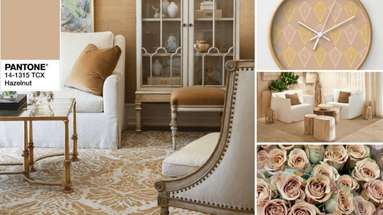
- Hazelnut. A universal color that will fit perfectly into any space and become an indispensable companion for all shades. To enhance the effect, you can use orange or pink accents in the interior.
- Serenity. Blue-lilac color is back in trend. Blue is the main color and gives depth to the room, while lilac gives expressiveness. Combine with rose quartz or peach shade.

- Flame. Orange-red color, reminiscent of flames, is an option for strong and confident people who are constantly on the move. Suitable for placing accents, combined with moderate shades.

- Peach Echo. The soft peach color remains an elegant solution for exquisite interior, whose furniture items are selected with special taste. This wall painting is complemented by dark accents and paintings. It is most successfully used in living rooms, bedrooms and children's rooms.

Painting walls in different rooms
Individual preferences when choosing suitable color for the walls in the room are dominant, but to achieve optimal result Some recommendations should be taken into account.
Hallway
This room in most apartments and houses is very modest in size, so the optimal color for such a room would be light (beige, Ivory, orange) with possible brighter accents. Due to this, the hallway will seem much larger.
Corridor
If the corridor is narrow, then several shades are used to paint it, which are recommended to be placed in the form of horizontal stripes. Interesting solution will create black central or side borders. The main color can be gray, light brown, beige.
The photo shows a corridor in beige shades; this color is considered the most used in such rooms.
 Corridors usually do not have enough daylight, so the main palette of paints for walls should be light colors
 Living room and hall
Provided that all residents constantly gather in the room, blue, light blue, purple and pink shades are optimal. They are complemented by gold, red and gray. For a room used in other situations, a more austere interior with a predominance of cool colors is selected.
Children's
Choosing paint for a nursery is more difficult, since you need to take into account the preferences of the child or teenager. Gender also plays a significant role: boys gravitate towards bright and complex color combinations, while girls prefer calm pink and beige shades with rich splashes. Naturally, such an interpretation is often conditional, therefore, taking into account the wishes of the child the best option is the use of natural colors and their shades.
The photo shows a children's room in yellow-green color. This combination is an excellent solution for a child’s room, as it has a positive effect on the still weak visual system, gives energy and at the same time calms the nervous system.

Bedroom
This room should promote relaxation and comfort, so the walls can be painted in shades of yellow, orange and green. It is better to abandon newfangled and experimental solutions that may look good on paper or in pictures on the Internet, but in reality they create an absolutely depressing impression.
Kitchen
If furniture items are provided bright colors, then the walls are painted in a contrasting tone. If the kitchen modules have natural colors in the classical interpretation, similar lighter or darker shades are selected. But to create modern interior The walls can be painted in bright colors: red, orange or indigo.
Cabinet
Brown, gray and beige shades are suitable for this room, which can be complemented by black accents. Everything should be in a calm and business-like manner. Modern offices for creative individuals are best painted green, red and blue or combinations thereof.
Bathroom
Large bathrooms are rare, and many of them include several areas, so individual colors are chosen for each area. Blue, purple, dark blue and light green shades interspersed with red or black are well suited for such a room.
 The bathroom is associated with water, so blue and its shades are most often chosen to paint it.
 The main thing when choosing the color of a room is to take into account the overall style of the house or apartment.
The influence of shade on the visual size of a room
Each shade affects not only psychological perception, but also visual one. The right color for wall surfaces can expand or narrow a room.
Coloring principles:
- It is better to decorate small rooms in calm, light colors, thereby enhancing artificial lighting and visually expanding the area.
- To make high ceilings appear lower, you can paint the walls in pastel colors and the ceiling itself in darker colors. This combination will increase the overall space.
- Desaturated green and blue visually expand the room.
- Relief moldings painted in the same color will help to enlarge the wall.
- At small area rooms should abandon provocative solutions and a combination of many tones. This completely eliminates the feeling of space due to the inability to concentrate. Also not the best solution will art painting, especially with large elements.
- To make large rooms smaller, orange and red shades are used, and to emphasize their status, deep gray and dark shades are used.
On a note! Since it is impossible to perceive all combinations, it is worth resorting to the use of special graphic programs. Color modeling in them is not always completely reliable, but it allows you to catch a good combination or reject a bad one.
Choosing colors from a feng shui point of view
Feng Shui is a Taoist practice responsible for organizing space. Based on this teaching, each element has its own color:
- water (north) – black;
- earth (northeast, southwest, center) – brown;
- tree (east, southeast) – green;
- fire (south) – red;
- metal (west, northwest) – white.
 Bagua - map of feng shui zones
 According to this eastern practice, common in Asian countries, each color has a specific effect on a person and is used for different rooms:
- Yellow . Symbolizes the sun, abundance and wealth. Creates a feeling of fun, comfort, strengthens hope and binds a person to home. Not suitable for dark rooms and bathrooms.
- Red . It is responsible for vital energy, therefore it is recommended for the construction of offices, but its excess leads to the opposite effect. Suitable for delimiting space and zoning. Should not be used in rest areas, hallways or bedrooms.
- Blue . A mysterious color that develops a sense of adventure and exploration. Suitable for living room, bedroom and office areas. A bad solution would be for the kitchen, hallway and corridor.
- Green . The basis of a new life, correct activity, but light shades indicate possible immaturity. Used for children's and teenage rooms, great for purposeful boys and girls.
- Orange . Can act as an additional color in the living room or short-term recreation area. You should not paint walls in offices and bedrooms with it.
- Peach. Symbolizes calm and is responsible for romantic appeal. Suitable for a room where a teenager lives, especially a girl. A slightly diluted shade is used to paint the living room and bedroom.
- White . Symbolizes purity and openness. It is used for walls in the nursery and living room and for highlighting areas in the kitchen.
- Black . Responsible for strength and solidarity, helps create intrigue. It is recommended to use shades of black that are suitable for certain areas of the walls. Not recommended for children's, teenagers', work or recreation areas.
Due to the fact that the modern interpretation of this practice has undergone changes, many meanings have been completely adapted to current conditions and have lost their original meaning.
Mistakes when choosing a color palette for walls
Mistakes when choosing paint colors that cause psychological discomfort:
- The period of illumination is not taken into account. At different times of the day daylight may change, so the presence of artificial light sources is of great importance.
- The overall perception is influenced by all the details, and especially the furniture: a sofa, armchairs, tables, cabinets should match the main tone or contrast.
- Feng Shui takes into account the combination of colors, because the practice is based on the endless movement of space. A bad solution would be to use yellow and green, red and black, yellow and blue in the same room.
But most problems arise from the fear of making mistakes. You cannot please everyone or adapt to every opinion and recommendation; it is individuality that creates harmony. An example would be a conditional ban on painting in dark color small rooms: if you choose a certain shade, the result can be stunning.