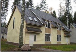
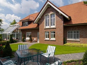
White facades have not been in fashion for a long time. They have been replaced by more interesting color solutions that loudly declare the individuality of the owner of the house.
When choosing a facade for yourself, it is important to rely not only on your favorite color scheme, but also on technical specifications: climate, geographical location, specifications, functions of the building, its dimensions, facing materials, structural elements.
Let's talk about combinations.
The selection of shade should be carried out taking into account the architecture of the object: the laconic and simple silhouette of the building is emphasized with light tones, and the complex architecture with bright colors.
You also need to take into account the texture and size of the elements. A smooth texture increases brightness, while a rough texture softens colors. The selection of colors involves highlighting all elements: doors, plinth, facade, roof, windows.
But these are all generally accepted rules. What if you want to stand out? If all your life you have wanted your home to be a reflection of your character. In that case, the next selection is just for you.
Options color solutions for facades.
- If you want to paint your home an unusual color that you love, but don't know what to pair it with, then simply choose a shade that is a couple of shades lighter or darker than the main one on the color wheel. And the highlight of your exterior will be Entrance door, painted in a contrasting color.
http://www.parade.ru/index.php?page=art-parade&cat=5&id_article=19&main=color
2. If your house is made of stone, wood or other unpainted material and you are looking for a color to paint the roof and other external elements, then try to find it in the facade material itself. These may be brownish-green spots on the stone, or dark shade"knots" in wood. Nature - best master on creating stylish color combinations.
3. The combination of gray and brown colors. These are earthy shades that are guaranteed to look good against any background. The combination of these colors is suitable for the facade of the house and the roof.


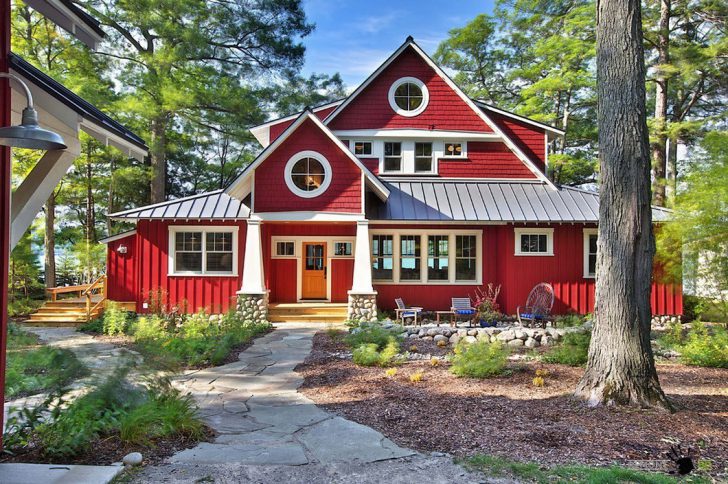
4.Deep ruby red shades are loved by facade designers not only for their luxurious appearance, but also for their ability to combine with the green plants that surround most private houses. Red and green are opposites on the color wheel, and provide the greatest contrast to each other. If your home has an interesting shape that's worth highlighting, paint it a color that complements the surrounding landscape.
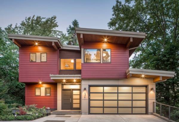
Derivatives of the same color spectrum will always be in harmony with each other. If the walls of the house are decorated predominantly in warm colors, then the roof needs to be installed the same warm color. But above the “cold” facade, the roof in such a solution will look quite ridiculous.
Beautifully painting the facade is not everything. Do not forget about the other elements present on it: the base and window frames; Garage Doors and drainpipes; platforms and stairs. The perception of color is initially subjective, so don’t be afraid to trust your eyes. The lining of the eaves and gable overhangs is selected to match the roof or in contrast to it. Also, gutters and drainpipes are usually matched to the color of the roof, but deviations are also possible here. These elements can be color synchronized with the façade.
For those who want their home to have impeccable style, it is worth thinking about how to choose the right roof shade.
Which color is suitable in a particular case depends primarily on the goals of the house owner: do you need to “hide” the building among the trees or highlight it and express individuality?
There are several basic rules, following which you can achieve an excellent visual effect.
- be combined with other elements of the building;
- harmonize with the surrounding landscape;
- correspond architectural style Houses.
The concept of “surrounding landscape” can also include surrounding buildings. If they are made in the same style, turning your home into a strikingly different building, a kind of black sheep, is not always appropriate - with rare exceptions.
 Sometimes it is very difficult to reconcile what is desired with what is actual. This thesis is also true in the choice
If the metal tile has a rich quality, then, for example, with all its excellent performance characteristics, such a choice cannot be provided. Therefore, the choice of color largely depends on the variety product range roofing.
Of course, you can find a way out of any situation: for example, paint slate or use slate instead, which has a rich tint palette, or you can also paint it, and this will also prolong the coating.
Theoretical basics:
- cold tones are the blue range;
- neutrals are green colors;
- warm - from yellow to scarlet.
It should be noted that this division is very arbitrary. And intense carmine red is perceived as warm in comparison with blue, and as colder in comparison with orange.
So, bright colors burn out faster, and a light-colored roof has a better chance of standing for a long time in its original form.
Also, dark roofs heat up more.
 Those who doubt their choice will come to the aid of special computer programs, with which you can change roofs, walls and façade elements on the 3D model and select best combination. Such programs already contain the shade palette of a particular roofing covering, various types finishing materials for the facade, including.
However, before purchasing roofing and Decoration Materials in an online store, it’s worth seeing how the chosen shade meets expectations in reality - since the monitor to some extent distorts the real picture.
In such an important matter as color selection, there are no trifles. Even the time of inspection is important, because under artificial and natural light the same tone of metal tiles will be perceived completely differently.
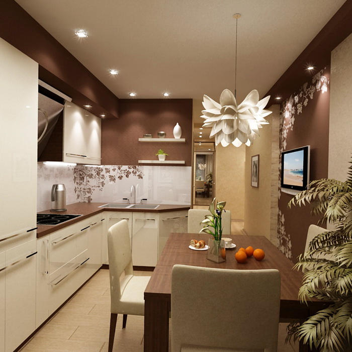
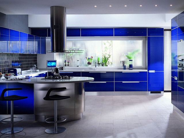
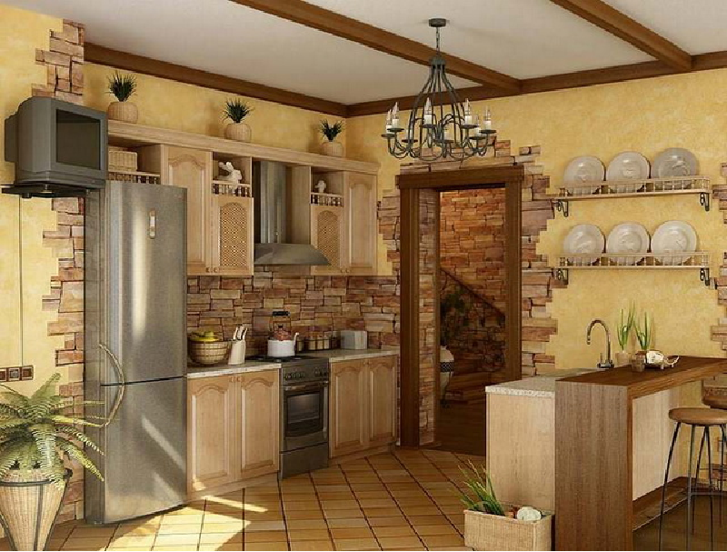
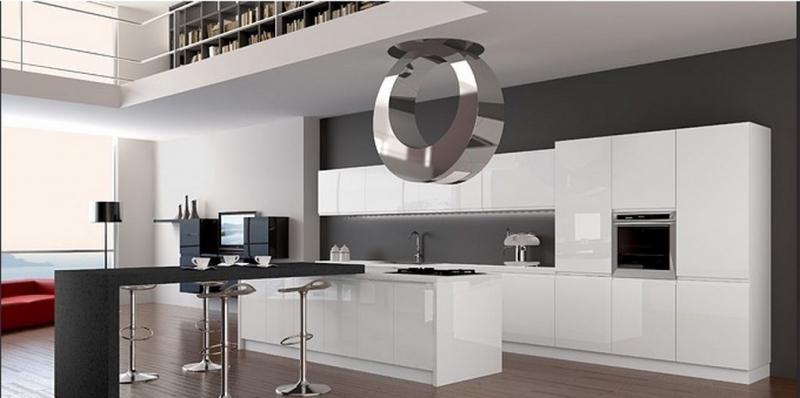
Over the past few years, we have experienced a real boom in changing styles. During this time, we have learned to make bold decisions in interior design and willingly get involved in the creative process of transforming our home. We are not afraid of bright colors kitchen facades in high-tech style, nor the stiffness of English minimalism.
The main thing is that what you create with your own hands is in complete harmony with your inner world.
The kitchen is the “heart” of the home
The most fertile place in the house for all kinds of experiments is the kitchen, since here we spend most of our time at home. It should be as functional, ergonomic and comfortable as possible.
Therefore, it is very important to work out all aspects of its design, including the color combination of kitchen facades. After all, this perimeter involves the intersection of the interests of all family members. It is not for nothing that in many cultures the kitchen is considered the heart of the home.
Psychology of color
Everyone knows that blues and depression can be cured bright colors, and calm down excessive irritability with the help of a calm palette of halftones. By choosing a color scheme for the interior, we not only express ourselves, but also set a special atmosphere for the space. It is very important to choose the palette and color of the kitchen facades that harmoniously fits into the overall outline of the chosen style.
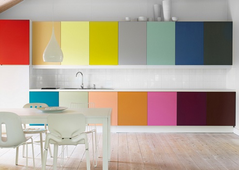
Basic “color” rules
There are two main groups of colors:
- Warm(stimulating);
- Cold(calming);
The charm of warm colors
The first group includes the following colors:
- Red;
- Orange;
- Yellow;
Red the color of kitchen facades is not recommended for use in small apartments, since its excess leads to rapid fatigue and irritation.
But if you have a large space, colored kitchen facades can become the main accent in the overall interior.

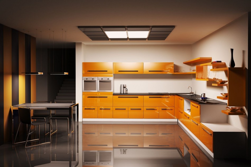
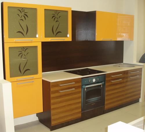
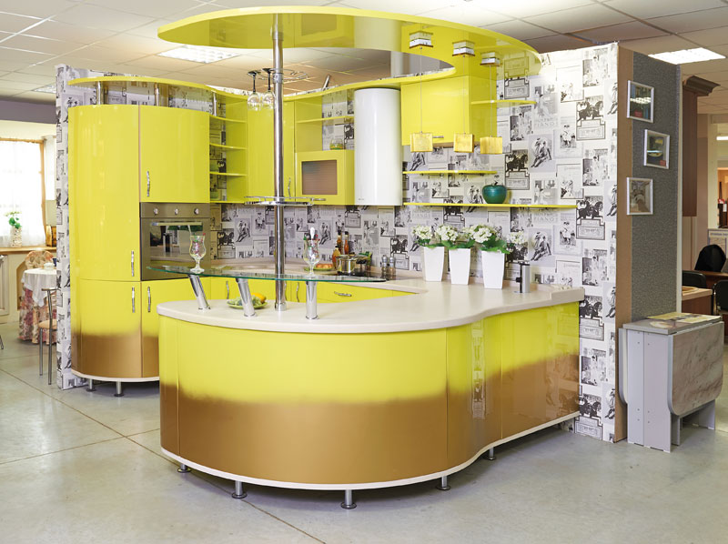
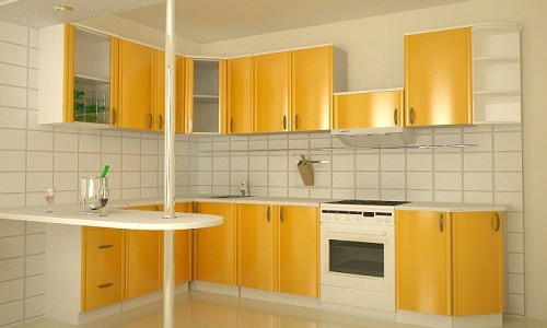
Have the opposite effect orange and yellow colors. They are the bearer of positive energy, friendliness and a comfortable environment.
![]()
Bright orange kitchens in modern style
The yellow colors of kitchen facades can bring a lot of light and warmth into the room. It is advantageous to choose it in cases where access natural light limited.
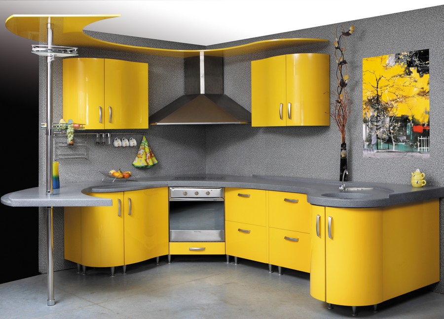
Yellow color creates light and warmth in the kitchen
Calm palette of cold
The primary colors of the second group are:
- Blue;
- Green;
- Blue;
The first color from the cold range is the color of the sky, of calm. It is best used in workspaces.
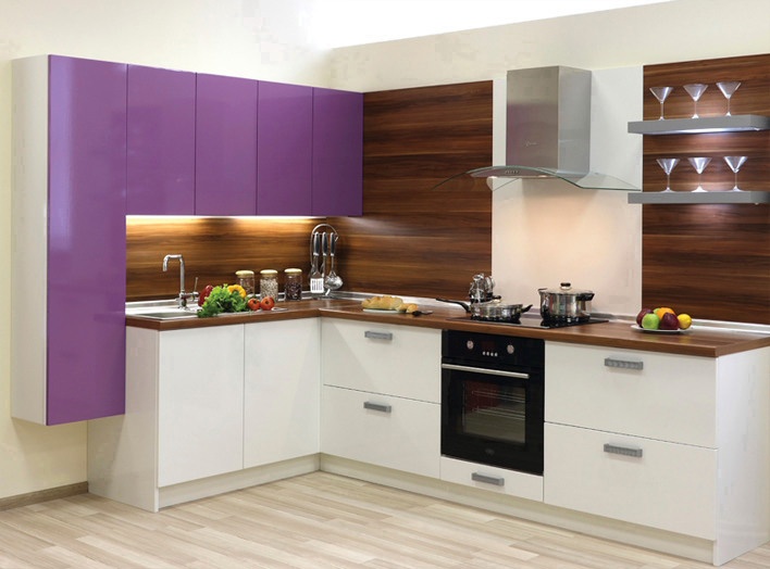
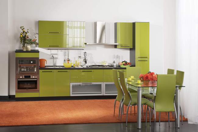
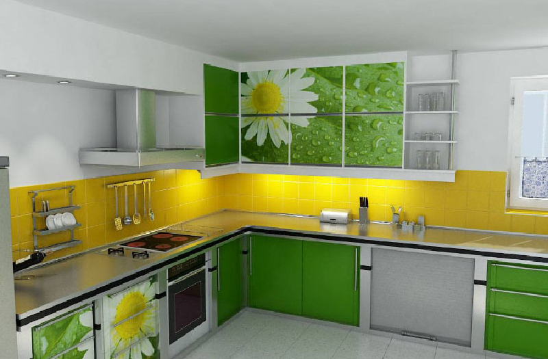
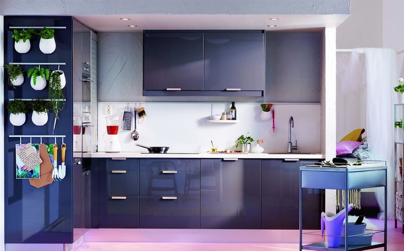
Always looks very impressive green kitchen facade. From a design point of view, green color is a universal color. It looks equally good in the design of bedrooms, living rooms, and offices. According to everyone, all its shades of green help to achieve inner balance.
Psychologists say that green is the color of decision making. If this is so, then for our compatriots, a kitchen with green facades is the most suitable option. It’s hard to even imagine how many issues we solve at the dinner table.
What else is attractive about kitchens with green facades? Freshness and a great opportunity to use “sunny” color. As a rule, yellow tones are added as a “warm” addition (photo). The combination of yellow and green is always positive and a lot of good mood.
Blue color, in large quantities, negatively affects the human psyche. Therefore, when experimenting with the interior in a similar range, be careful, especially if its location relative to the cardinal points is defined as northern.
However, if you dilute the space in the right proportions with orange kitchen utensils or yellow curtains, then Blue colour, may play completely differently.
Blue kitchen - calming and modern
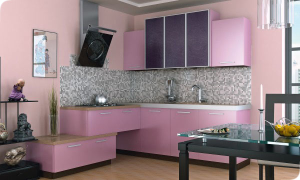
Talking about purple color or indigo color, we can say that this is not a natural color that is not inherent in natural nature. Therefore, its use in residential spaces is best minimized. This color is rather nuanced; if you add a few purple elements to the kitchen interior, it will help create an extravagant atmosphere.
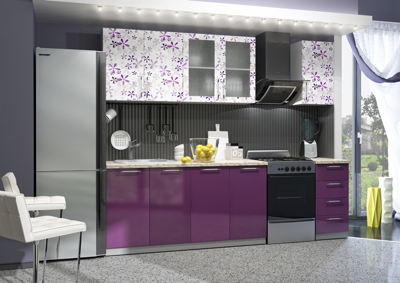
Violet kitchen set Flora
Inconsistency of colors
Designers have this hint - color circle. Based on the rules dictated by him, you can create original projects, which subsequently can become your pride. We have already talked about some combinations acceptable for kitchen facades.
But there are also some restrictions that you should be aware of. According to the same magic circle, it is not recommended to combine polar colors in one room, i.e. those that are located opposite each other.
For example, this applies to orange and blue, red and green. If they are used in equal proportions indoors, then as a result we can “earn” a feeling of depression or imbalance. Polar colors are more likely to complement each other.

An exception
However, as with any theory, there are some exceptions to the rule. So, until recently, the combination of brown and blue color, was considered outright bad taste and a sign of bad taste.
It became possible just recently to combine them into one composition. Our industry has learned to create new shades, new paints. In this connection, original design projects began to appear on.

The intrigue of dazzling white
Now, as for the white color. Recently, it has become the most popular when choosing an interior. But you should not use it carelessly; it is when choosing white that the greatest number of mistakes are made. An excess of light colors can lead to the creation of a boring interior, from which it will smell cold and empty.
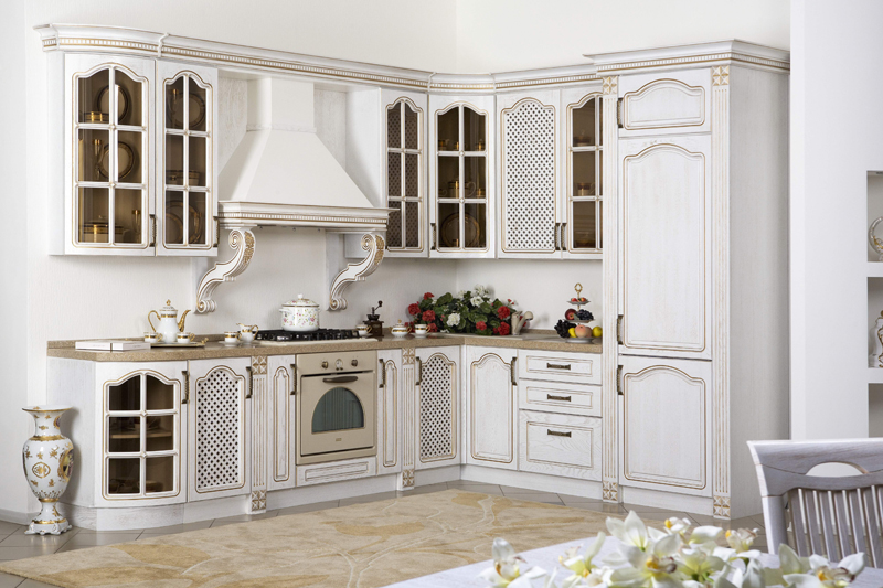
White kitchen in classic style
But when the right combination with other colors, it can bring a sense of space, freshness and elegance. That's why white facade kitchens, it will look most advantageous with shades of beige and gray. Effectiveness in interior design can be achieved through bright accents, V . How to use this technique correctly is shown in this video.
Since light colors are able to reflect light, their use will visually enlarge the room. Therefore, white facades can be recommended for small kitchens. This topic is especially relevant for housing from the old stock.
Advice There is an opinion that White color not very practical.
You should not succumb to the general misconception. Otherwise, it seems that the color for the kitchen facades is chosen solely from the point of view of ease of use.
Or the fact that owners of colored furniture are less likely to clean.
Modern household chemicals, allows you to keep interiors made of any materials and any shades clean. The instructions will always tell you how to achieve maximum effect.
Base quality
A separate topic for conversation is the materials used in production kitchen furniture. But if we talk about the price-quality ratio, then in this sense, MDF has no equal. The use of fiberboard is so invariant that it is difficult to list all the technologies using it.
By applying enamel to the surface of the original material, you can achieve any color MDF facades for kitchen. Our compatriots especially liked the new product of the last season - decorative coating"chameleon". The color changing effect when the lighting changes will become the highlight of your interior.
Also, postforming technology offers a varied palette. Rich color of the facade MDF kitchens and seamless surface are the hallmark of this know-how.
Conclusion
In order for your stay in the kitchen to be pleasant and fruitful, try to create a real center of warmth and comfort in this part of the house (see also). After all, color is life, so be careful about what colors you surround yourself with.
Gallery