Tasks: get acquainted with the characteristic of color “saturation”, study the expressive possibilities of monochrome combinations in various options saturation and lightness.
Saturation– the degree of difference between a chromatic color and an achromatic color of equal lightness. Saturation characterizes the presence of achromatic impurities in a given color tone.
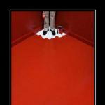
Monochrome (from “mono” - one, “chromos” - colored, which means “one-color”) gamma is based on one chromatic color and its shades of different lightness and saturation. Light shades are obtained when mixed with white (bleached, whitish, light tones). Dark colors– when mixed with black (blackened, dark tones). When adding different shades to spectral colors gray we get broken lines colors. In everyday speech, broken colors are described with the words “dull”, “grayish”.
Exercise 2.1. Construction of monochrome rows (bleached, dull, blackened tones) of the original color. Each row is performed in the same way as the achromatic row from exercise 1.1, but with fewer tones (7 instead of 9). Choose any color from the main color groups, for example, from the yellow group - cadmium yellow or ocher, from the green group - chromium oxide, herbal green, emerald; from the blue group - iron blue, ultramarine, cobalt blue; from the red group - cadmium red, purple. Paint the original color.
The first row is 5 whitened shades (equal transitions from the original color to white).
Second row – 5 broken (dull) shades (equal transitions from the original color to light gray).
Third row - 5 broken (dull) shades (equal transitions from the original color to medium gray).
Fourth row - 5 blackened shades (equal transitions from the original color to black).
Thus, each row will consist of the initial color, achromatic and five transition shades.
Draw up monochrome rows on an A4 sheet (see Fig. 13, 15, 17, 19).
Having completed monochrome series, consider and analyze the results. Whitened tones give subtle tints of color. U light colors, such as yellow, color transitions are less noticeable than dark ones, such as blue, red, purple. The combinations of whitened tones are monotonous and monotonous. But some paints reveal their beauty precisely in the whiteness, for example, red iron oxide, ocher, iron glaze, chromium oxide. When bleaching chromatic colors, we get lighter and cooler shades.
Mixing with gray tones gives complex and sophisticated shades that can be called “pastel”. When mixed with light gray, it produces soft and unexpected shades of orange and purple tones.
Black color softens many “caustic” colors. Tapestry artists know well that by dyeing yarn in black dye, many colors can be improved and enriched.
Monochrome harmony can be called economical. Such combinations are comfortable for the viewer and the artist; with the help of monochrome shades it is easier to maintain the integrity of the form, focusing attention on any idea, thought or emotion.
Shades of the same color, differing in lightness and saturation, are most harmoniously combined with each other. Pure color can be combined with dark and light shades, in which case a strong contrast in lightness and saturation can be achieved. The combination of broken tones that are close in lightness creates subtle color relationships. As a result, compositions based on combinations of three types of saturation of the same color may appear multi-colored. The impression of multicolor will be facilitated by the fact that some colors change their color when mixed with achromatic tones. Yes, yellow and orange colors when mixed with black they become greenish, red and purple when mixed with gray acquire coldish, lilac shades.
When achromatic tones are included in a composition, a instant contrast, which causes them to be “visually” colored in an additional color, which further enriches the monochrome range. The term “simultaneous” (“simultaneous”) refers to the ability of chromatic and achromatic colors placed on a colored background to acquire a shade complementary to the background one. Simultaneous contrast is more noticeable when the subject and background are similar in lightness.
Monochrome harmony can be seen in many types of fine, decorative and applied arts and design. Examples include painting on porcelain: Chinese porcelain, Gzhel painting. Many paintings by Rembrandt, Caravaggio, and the small Dutch are based on monochrome tones. Monochrome colors are often used in interior design.
Single-tone harmonies are similar to achromatic harmonies and can be built across different lightness ranges.
Exercise 2.2. Decorative still life. When performing the exercise, you can use any monochrome shades from Exercise 2.1. Task: to reveal the decorative expressiveness of the monochrome range.
– develop a sketch of a decorative still life, the composition solution is planar, the contours of the elements should be simple, for this it is recommended to use the technique of geometrizing the form. The number of elements in the composition should be sufficient to use a variety of shades;
– choose monochrome shades of varying lightness and saturation so that the composition does not look monotonous and boring.
Technique – applique, format 12×12 cm.
Exercise 2.3. Decorative still life: monochrome range combined with achromatic tones. Colorings from exercises 1.1 and 2.1 are used. Technique – applique, format 12×12 cm.
For the second option, it is possible to use the composition from the previous task, adding achromatic tones. In the above examples, you can see the phenomenon of simultaneous contrast: surrounded by blue tones, achromatic tones look warmer, gray takes on a beige tint (Fig. 18). In Figure 20, gray tones acquire bluish shades in a lemon-yellow tones. In the following picture, the bluish tint of the gray color is clearly visible, surrounded by orange tones.
If in a composition it is necessary for achromatic colors to retain their character, then they should not be the same in lightness as chromatic tones.
Exercise 2.4. Two-color polar compositions in various saturation options. This exercise explores the following types of contrasts: chromatic contrast, saturation contrast, and complementary color contrast. Pairs of complementary colors have the strongest color contrast. By lightening or darkening colors (thereby reducing color saturation) you can get different color combinations in a large number of variations. The inclusion of achromatic colors (white and black) is an important element in the composition. The most interesting results are obtained if one of the colors is assigned the main role, and another color is used in small quantity, only to emphasize the qualities of another.
Sequence of the exercise:
– for the selected color from the first exercise, select an additional color (pairs: red - green, orange - blue, blue - yellow, etc.), make the necessary colors of the second color of different saturations;
– develop a composition of stylized elements;
– on the first sheet place one composition of whitened tones with the inclusion white and one composition of blackened tones with the inclusion of black;
– on the second sheet place: one composition using dull tones with gray tones and one composition using tones of three types of saturation including white and black.
Technique: appliqué. The format of the compositions is 10×10cm.
Examples of completing the task are presented in Figures 23, 24, 25.
Monochrome color scheme.
Monochromatic uses a changing color scheme
brightness and saturation of one color. This scheme looks clean and elegant.
Monochrome colors combine harmoniously, creating a calming effect.
A monochromatic scheme is very easy to match by eye, especially with blues or greens
shades. You can use it to create an overall mood. Considered monochrome
range of colors such as black, white or gray.
Advantages: The monochromatic circuit is easy to operate and always looks
balanced and visually appealing.
Minuses: This scheme lacks color contrast.
Adviсe: 1. Using tints, shadows and tints from primary colors.
2. Try to use more nuances in the design, while maintaining
simplicity and elegance of monochromatic scheme.
Similar color scheme (similar triad).
An analogous color scheme uses colors that follow each other on
color wheel (within one quarter). They are also called relatives. One color is used as the dominant color while the others
are used to enrich the circuit. Similar color schemes are often found in nature. They are harmonious and pleasing to the eye.
The analogue scheme is similar to the monochromatic one, but offers more nuance.
Advantages: A similar color scheme is just as easy to create as a monochromatic one, but it looks richer.
Minuses: A similar color scheme also lacks color contrast.
Adviсe: 1. Don't use too many shades in a similar scheme as this can ruin the harmony.
2. Avoid combining warm and cool colors in this scheme.
Classic triad.
This color scheme uses colors that are evenly distributed around the color wheel.
This scheme is popular among artists because it offers strong visual contrast
while maintaining balance and color saturation.
Advantages: The process color scheme provides high contrast while maintaining harmony.
Minuses: A process color scheme does not have as much contrast as a complementary scheme.
Adviсe: 1. Choose one color that will be used more than the others.
Additional color scheme.
Colors that are opposite each other on the color wheel are
are considered complementary colors (for example: red and green). High contrast complementary colors
creates a dynamic look
especially when used at full saturation.
Using one color for the background and additional colors for the highlight important elements,
you will get color dominance combined with sharp color contrast.
Advantages: The complementary color scheme offers strong contrast,
than any other color scheme.
Minuses: This scheme is more complex than other monochromatic and similar schemes.
Adviсe: 1. To achieve best results, combine cold colors with warm ones, for example,
blue with orange.
2. If you are using warm colors(red or yellow), then the accent can be discolored with the opposite cold
color, i.e. placing more emphasis on warm colors.
3. Avoid using unsaturated heat color range(eg brown or dull yellow).
Rectangular (Tetradic) color scheme.
The rectangular (Tetradic) color scheme uses four colors that form a harmonious harmony.
The rich color range includes many possibilities for variations.
A tetradic color scheme works best if you make one color dominant.
You should also pay attention to the balance between warm and cool colors in your design.
Advantages: Rectangular (Tetradic) color scheme uses more various colors than any other scheme.
Minuses: This circuit is a rather difficult balance circuit.
Adviсe: 1. Avoid using pure color in equal quantities.
Monochromatic scheme is a combination of colors within one color tone.
The use of monochromatic schemes when painting interior walls is usually good decision given that good choice main (basic) tone, taking into account the size of the room, its illumination and functionality.
At the same time, even contrasting pairs taken on the periphery of the color wheel do not conflict.
The creation of monochromatic schemes is achieved by adding white to any selected color, obtaining various light and desaturated shades that harmoniously combine with each other in any combination due to the general color relationship. Reducing color saturation is achieved by adding gray.
By adding black to the base color, darker and less chromatic shades of the base tone are obtained, widespread in nature and painting. And in this case, the selected contrasting colors will be closer to each other. ()
Monochromatic on the color wheel harmonious combinations presented in sectors (each sector of the same color is a monochromatic scale):


Like this color combination (picture from Wikipedia):

Push:
Drawing a conclusion from what you have read on the topic of monochromatic combinations, you need to keep in mind 2 points (in relation to the topic of color type and wardrobe):
1) There are color subtypes that themselves represent a monochromatic palette, such as, for example, low-contrast summer and autumn. I will not list them now; as I analyze them, I will mention their type of harmony. For such subtypes, it logically follows that their wardrobe is based on monochromatic harmony. However, even by themselves, without clothes, these subtypes look monotonous, and clothing in the same monotonous monochromatic range will make them an indistinct spot of the same color. What should we do in this case? Solutions in this vein are obvious: diluting the monochrome composition with achromatic colors and adding an accent. But the accent for such subtypes should not be looked for among additional colors, because it will shift all the attention of their delicate coloring to itself, and the most advantageous would be to take an accent among related colors from the analogue scheme, which we will also talk about. In this way, we break the monotony of the image, but do not interrupt the entire delicate color with a bright spot of contrast.
2) For subtypes that are not characterized by monochrome, it is still better to avoid monochromatic combinations of shades in the wardrobe, despite the fact that such combinations are sometimes simply convenient and easy to select. And if all the clothes in the ensemble are monochrome, then be sure to focus on accessories or at least makeup. We take accent colors either complementary or from the colors of the triad. For example, a lady is dressed in an ensemble of red shades, which means that for accessories we select either green (complementary color), or blue, or yellow colors(according to the classic triad), either black, white or gray.
In general, monochromatic combinations are a win-win option when you don’t want to draw attention to yourself, or when the situation requires you to be invisible and not distract attention. For example, the interior and uniform of the staff of medical institutions, catering services, secretaries, receptionists, teaching staff, private detectives, something like that.
In makeup, monochrome combinations are widely and successfully used in eye shadow. Most eyeshadow palettes are made in monochrome tones. They are very easy to use, easy to apply, blend on the eyelids. It is monochrome that allows you to shade the eye, emphasize the look, without dragging the blanket from looking at the eyelids themselves. This is the perfect makeup for all occasions where no special skills or craftsmanship are required. The only condition is that the palette must match the color of your skin and eyes, and you need to select lipstick accent color so that the face is not monochromatic.
It is especially successful to use the principle of monochrome in the interior of premises where a calm atmosphere is needed - in bedrooms, bathrooms, in production, in educational and medical institutions, in premises for funeral services. Monochromatic combinations do not distract, they serve as a background to something else. This is, perhaps, their main advantage.
Homework: What animals and plants in nature are colored monochrome? Why do they have this coloring?
With the help of color we create a mood for ourselves and those around us; We emphasize our style and individuality. In the combination of colors, as in photography, there are certain rules and principles. The easiest way to understand combinations of colors and their shades is to use color wheel . There are several combination options.
1. Monochrome combination (monochrome gamma)
suggests a calm and soft combination of colors that are in the same color sector. Main color, two accents and perhaps additions in neutral tones.
2. Complementary combination (two-color scheme)

It involves combining two colors in one outfit, opposed to each other. According to color theory, a warm shade of one color is combined with an opposite cool shade. On the color wheel, pairs are determined simply by drawing a straight line from one color to the other.
3. Triadic combination (tricolor scale)

This is a choice of 3 colors located at the same distance from each other. Just enter in color circle equilateral triangle, and it's in the bag!
4.
Rectangular combination
(four-color range)

consists of two complementary colors and their corresponding analogues. This is a fairly diverse combination option, requiring a precise balance of the main and additional tones.
Using the color wheel, you can create combinations of three, four, five or six colors, diluted with neutral black, gray, white and beige colors.
Here's a little hint on color combinations:
1.
White: goes with everything. Best combination with blue, red and black.
2.
Beige: with blue, brown, emerald, black, red, white.
3.
Grey– basic color, goes well with moody colors: fuchsia, red, purple, pink, blue.
4.
Pink– with brown, white, mint green, olive, gray, turquoise, soft blue.
5.
Fuchsia(dark pink) – with gray, yellow-brown, lime green, mint green, brown.
6.
Red– suitable for yellow, white, brown, green, blue and black.
7.
Tomato red: blue, mint green, sand, creamy white, gray.
8.
Cherry red: azure, gray, light orange, sand, pale yellow, beige.
9.
Raspberry red: white, black, damask rose color.
10.
Brown: bright blue, cream, pink, fawn, green, beige.
11.
Light brown: pale yellow, creamy white, blue, green, purple, red.
12.
Dark brown: lemon yellow, blue, mint green, purple pink, lime green.
13.
Tan: pink, dark brown, blue, green, purple.
14.
Orange: blue, blue, lilac, violet, white, black.
15.
Light orange: gray, brown, olive.
16.
Dark orange: pale yellow, olive, brown, cherry.
17.
Yellow: blue, lilac, light blue, violet, gray, black.
18.
Lemon yellow: cherry red, brown, blue, gray.
19.
Pale yellow: fuchsia, gray, brown, shades of red, tan, blue, purple.
20.
Golden yellow: gray, brown, azure, red, black.
21.
Olive: orange, light brown, brown.
22. Green: golden brown, orange, light green, yellow, brown, gray, cream, black, creamy white.
23.
Light green color
: brown, tan, fawn, grey, dark blue, red, grey.
24.
Turquoise: fuchsia, cherry red, yellow, brown, cream, dark purple.
25.
Electrician beautiful with golden yellow, brown, light brown, gray or silver.
26.
Blue: red, gray, brown, orange, pink, white, yellow.
27.
Dark blue: light lilac, blue, yellowish-green, brown, gray, pale yellow, orange, green, red, white.
28.
Lilac: orange, pink, dark purple, olive, gray, yellow, white.
29.
Dark purple: golden brown, pale yellow, grey, turquoise, mint green, light orange.
30.
Black versatile, elegant, looks in all combinations, best with orange, pink, light green, white, red, lilac or yellow.

Color range of different clothing styles
Business style

Color spectrum business style does not exceed 4 colors. 2-3 colors are considered the best, and with 4, two of them should be close in tone. The business style is based on multifunctional colors: black, dark blue, white, gray, beige. Then restrained, little emotional, medium-warm shades: brown, burgundy, gray-blue, sea green, bottle, emerald, mustard, sand, dark purple.
IN light shades pastel colors predominate: all shades of beige, purple, blue, gold, etc.
The main task of the color scheme in business style clothing is to create a neutral or inviting background for successful negotiations.
Yes, predominance dark tones in combination with clothes it adds solidity to you.
Prevalence light shades- sets you up for positivity, the conversation can move in a more friendly direction.
Contrasting combination dark and light– create a neutral background for conversation.
Classic style

In terms of complexity, it is similar to the color scheme of a business style. Mostly 2-3 colors, but a full four-color palette is also possible.
Classic range differs from a business one in the variety of available shades and color accents. The main feature of the combinations is restraint and emphasized elegance. Flashy colors are considered bad taste, so all light, rich, pure tones are rejected. The more complex the color, the more it fits into the color scheme of the classic style. The exception is pure red.
Combinations are based on black, dark blue, gray, Brown. Dark colors
V classic style are preferred, although a light palette is also present.
Light colors is built on the basis of white, beige, light gray, light brown shades. Additional colors are selected from the pastel range.
In the classic style, you can use colors such as gray-violet, cobalt, deep turquoise, gray-blue, blue, gray-blue, burgundy, raspberry, lingonberry, red, terracotta, peach, pale pink, lilac, sand, gold , camel, the color of young wheat, shades of ocher, many shades of muted greenery.
Evening style

This format welcomes bright, enchanting shades. The complexity of the color scheme can reach up to five colors. The purpose of an evening wardrobe is to attract attention and present you in a favorable light. Therefore, it becomes difficult to choose the main color (in this style it is necessary) - it must suit you perfectly. Unlike the “classic” colors (black, white, gray, brown), which suit almost everyone, other shades are “capricious” in terms of combination with appearance. To select a color you should use color type theory.
IN evening style used and dark, medium and light colors. Colors should be, if not saturated, then distinct. The most commonly used combinations are black, white, gold, and silver. If you are using pastel shades, then they need to be supplemented with contrasting or stronger shades, or gold or silver colors.
IN evening style dark blue, turquoise, blue-green, indigo, electric, blue, azure, emerald, marsh, olive, mint, yellow, light yellow, gold, pink, magenta, lilac, raspberry, burgundy, lingonberry, ruby, red are welcome , scarlet, orange, peach, red, terracotta, lilac, violet, amethyst and other colors.
Color spectrum romantic style clothes
Romantic style

Romantic style clothes allowed six-color range by combining fabrics with patterns. But this does not mean that simpler scales should be ignored. Romance in this style is achieved through soft, quivering bed tones combined with bolder, but equally naive shades. Dark colors, with the exception of black, are practically not used. Medium shades can be magenta, lilac, gray-blue, dark blue, turquoise, thrush egg color, brown tones closer to yellow and orange, carrot, honey, ocher, coral, terracotta, amaranth, red rose, strawberry, lilac, amethyst, olive, fainting frog color, etc.
Pastel - basic - tones will be represented by a light beige range, yellow, orange, red, pink, blue and lilac shades strongly diluted with white.
In general, the color scheme can consist entirely of pastel colors, or can be shaded with a contrasting color.
Casual style

Kazhl– semi-sports style or style big city. Unlike sportswear, which is dominated by bright and contrasting shades, kazhel strives to minimally attract attention to itself. The main task of such clothing is comfort, both tactile and visual. Therefore, the main shades will be medium light colors and saturation: all shades of brown, muted blue, violet closer to gray, shades of ocher, red, terracotta, amaranth, gray, muted green, khaki. Black color is often complementary rather than used as a primary color. Light shades Casual styles belong to pastel colors, but unlike the romantic ones, they tend to gray shades.
The combinations of this style are smooth, without sharp transitions, and if there is an accessory that sets it off, then it does not catch the eye like, for example, red, but fits ergonomically into the composition. In general, the color scheme imitates natural color combinations.
Creative style

This is the most diverse palette with the most unexpected combinations. In most cases, either bright accents , or overall a pretty catchy combination. Of course, the complexity of the range is not limited, although it is worth remembering that more than six shades will strain the eye. Oddly enough, this style often uses black, both as a base and as a complement. With its help, the extreme contrast that creative people strive for is achieved.
In general, you can fit all shades into this style, the limit of compatibility of which will be their harmony with each other and with your appearance. It would seem so simple, but it is precisely the lack of framework that makes this style the most difficult, since you walk the fine line of ugliness and creativity.
Sources lookcolor.ru, amazingwoman.ru
Attention! All rights belong to the site
The use of materials from the site without an active link is prohibited.
One of complex tasks while working on the design of a particular project, there is and will always be a choice of colors and selection color palette. It’s good if you can build on the brand’s colors, but this is not always convenient. At a minimum, if the logo is black and white or white and red. There are already so many of the same red and white sites on the Internet that the next one simply becomes boring and uninteresting, even indifferent to what is sold or what is talked about on its pages. Designers choose colors for their next design in different ways, but for some reason ideas and thoughts about using a monochrome palette do not come immediately.
But in reality, single-color designs have a greater emotional impact on users, offer more space for imagination and creativity, and can even be very different and... versatile. Some masters manage to create websites in a single-color palette so beautiful and amazing that the average user begins to perceive the most banal things on the page in a completely different way. It even seems to them that there are very, very many flowers.
In this material, we will take a closer look at the features of a monochrome palette in web design and figure out how to create it in the easiest and fastest way.
Base
The most difficult moment when starting to work on a monochrome palette is choosing the main color. A color from which you will have to build, which will be present on its own quite often. Colors whose shades suit the theme and style as a whole. But the simplest thing is the mood. Think about it and choose a basis based on associations accepted over many centuries.
Red - love, green - hope (eco), pink - romance, blue - trust, yellow - energy, purple - fantasy, faith.
Take a closer look at the brand and pay attention to one particular color. Perhaps he can become the main one, setting the mood for the entire project. Or if the logo is colorless, think about why the site is being created and for whom, select a base for these purposes.
But before you settle, it's worth thinking about the saturation and shades of this base color. They may, despite the color itself, not fit the project, be provocative or, conversely, very light (pastel). You may have to combine them somehow, but it shouldn’t look tacky either.


Some examples have high contrast and even thanks to one extraneous color, changes in colors are visible and obvious, and it becomes clearer for users where to click, and where, and what to read and watch. To simplify the selection of shades, it is better to always have a table of colors and shades on hand. We also talked a lot about them (link above in the article). Then identifying the main working “colors” will be much easier and faster. And, of course, we should not forget that the monochrome palette is not only color. No, it also involves working with background textures, images, shading, and gradients.
Combination with elements
Great, we chose the color of the monochrome palette! But how can we now make sure that the users’ eyes (and our own too) do not scatter all over the canvas due to an overabundance of shades and tones? Typically, for this, web designers do not use the closest color deviations from each other. Then the spread of tones becomes sharper and visual concentration becomes easier.


Almost, but not yet monochrome
An almost monochrome palette is similar to the option when an alien color is added to the monochrome one. But in in this case, web designers reduce the palette they have collected for a particular project to a couple of colors (tones) and add a completely different color that is, well, very far on the spectrum. For example, for gray - scarlet, for green - orange, for blue - yellow, and so on. This option cannot be called completely monochrome; rather, it is “almost monochrome”.
But it can solve several problems with highlighting elements, important buttons, headings, blocks and other things. It is also very convenient to use a contrasting color for small text. For examples, look at nstudio, cfli, in which shades of blue and purple dominate over red and orange. But it is bright and contrasting warm colors that break the monochrome. And compare with
Many famous projects use monochrome to introduce new products or services and this is considered convenient for users, since the human eye is not distracted by the variety of colors; on the contrary, he gets the opportunity to concentrate on the content. It's a difficult moment for all web designers, whether they're newbies or masters, when it becomes boring for regular users. Often, you and I get tired of the same design within five years if we visit the same resource every day. The eyes and our perception want something new, fresh. That's why successful decisions monochrome is not used throughout the entire project, but only in some areas, sections or on individual pages. Then the color transitions can be replaced over time, the data can be updated separately and the design can be slightly refreshed. Or, for example, select periodic new colors for one page of the site and thereby attract users: “ oh, we have updated the design of the services page. Check it out, what do you say?” And, in a way, Feedback with clients, and attracting to visit the site. Thus, the monochrome palette plays many important roles in web design and can be incredibly different. But at the same time, each individual site looks impressively beautiful and visually pleasing.