I have one quirk. I get terribly angry when people use terms that they don’t understand, and when you correct them and say that no, this word means something completely different, they respond, “But that’s how I understand it!”
I perceive this as “I don’t give a damn whether you understand me or not, I’m not speaking for you, but for myself” and then a logical question arises in me - “why the hell are you addressing your speeches _to_me_?”
As they say, any thing can be called a “tram”, the main thing is that others agree with you. That is, what is important is not what _you_ understand by the term you use, the main thing is that you are understood by those _for_ whom_ you use it.
From time to time I swear until I scream about this topic with Shashka. He is generally a fan of using words exclusively in the way that is convenient for him, absolutely not giving a damn about their dictionary meaning.
Well, for example, a couple of years ago it turned out that he did not know the meaning of the word “homophobia.” I asked him something about this same homophobia and suddenly I realized that he was telling me some kind of nonsense in response.
After interrogation with passion, it turned out that the dude, not knowing the meaning of the word, instead of looking it up in the dictionary, for some reason decided that he would quickly figure out the meaning himself. “Homo” is, as you know, “human”, which means “homophobia” - “fear of people”! And he, without blinking an eye, begins to use this word in precisely this meaning. Fine?
No, understand, I don’t mind the fact that someone somewhere sometimes doesn’t know the meaning of a word. Well, you don’t know what “homophobia” is - well, thank God. This is just normal and does not raise any questions. What raises questions for me is this wild decision - to come up with the meaning yourself. Moreover, to have the audacity, after you have been corrected, to persist and prove that it is your understanding that is the most correct, and the rest are all idiots and use this word incorrectly! This is what really drives me up the wall. I could have just hit him on the head with a hammer!
What is this all for?
Right now I came across a friend’s post about color types again and again I see that by “warm” and “cold” colors everyone understands what they want. The main motive is “that’s how I see it!”
And I understand why they say that! Because you revere those citizens who are considered experts in matters of fashion and style and you want to retire into the desert. Because subjectivism rides on subjectivism and drives subjectivity. And this is considered normal for them and everyone around them also begins to consider this normal.
(I’ll make a reservation that in in this case This is by no means an attack on a friend! She just wrote for herself and _for_herself_ and didn’t bother teaching anyone (it’s the other way around - I went to her to teach her how to use terms correctly, hehe :)), I just remembered that I’ve had a grudge against this for a long time topic.)
God be with them, with fashion and style, but let's not increase the chaos, at least in matters of the psychophysics of perception.
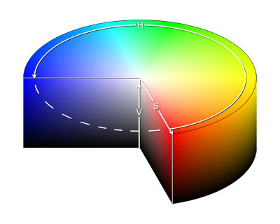
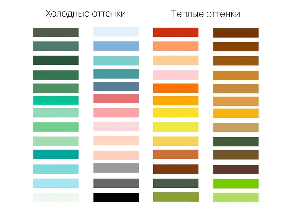
Warm and cool colors are distinguished very easily. Like this:
The divide between cool and warm colors runs along the border between red/magenta and green/blue.
On this border between red and purple is pink color, and between green and blue - turquoise, and therefore these are the colors that balance on the border between warmth and coldness and, depending on the nuances of the shade, they can turn out to be either cold or warm.
But even here there is a formal criterion. For example, pure pink in the RGB system is G=0, R > B.
Moreover, if B > R/2, we get cold pink (closer to purple), and with B < R/2 - теплый розовый (ближе к красному).
It's the same with turquoise.
In general, the point is that the color wheel is stupidly divided in half into a warm and cold half at the points R=B and G=B.
Calling yellow a cool color is an oxymoron. It's like "light black".
If a stylist says this, then for me personally this immediately indicates his professional level. Maybe not the lowest, but it’s immediately clear that a person is easily carried away into subjectivity, and such professionals are not suitable for me personally. If we talk about “cold yellow”, then at least this: “this is yellow, which at a given saturation can seem cold” something like that.
Yes, I understand that pale yellow seems colder than rich yellow, but we must distinguish “seems” from reality. A white sheet of paper, if you look through it at the sun, also appears black, but this does not make it black. And pale colors differ from bright ones only in _saturation_. And warmth and coldness are characteristics of a _color_tone_.
When [normal people] say “cooler tone,” they mean that it is closer to the blue end of the spectrum, not that it is less saturated (then they would say “paler tone”). Lemon yellow is indeed cooler than canary yellow, but not because it is lighter, but because it is closer to green, and through it - to the blue sector of the circle.
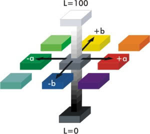
Strictly speaking, any color generally has only three characteristics: hue, saturation and lightness.
Color is a vector in three-dimensional space:

Maybe someone will find the following diagrams clearer:
 |  |
 |  |
Or like this:

Characteristics such as warmth and coldness are, of course, not entirely from psychophysics; designers have already come up with this for their convenience (and it all started with Privy Councilor Johann von Goethe, but that’s okay). But the basis for this division is the same notorious color wheel.
When colors are mixed not on the monitor, but, for example, on fabric, where color mixing can occur as a mixture of pigments in which the fabric is dyed (i.e., a mixture of reflective particles included in these pigments), or as a mixture of threads of different colors during manufacturing canvases - different visual effects may appear.
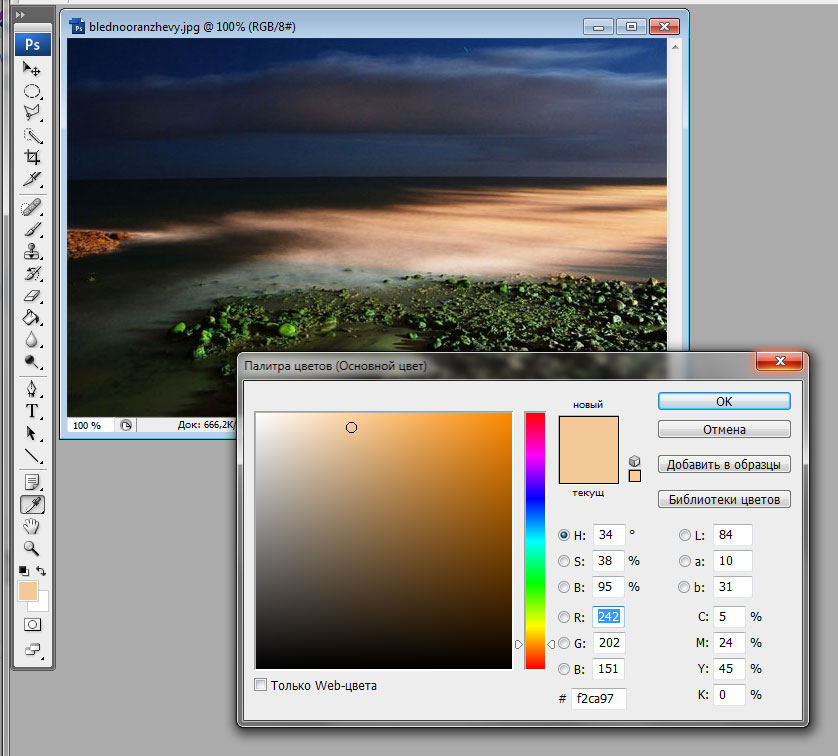
But we must understand that these are just effects. This is the same “seems” as with a sheet of paper. And what if we take a photograph of this fabric, then open its image in Photoshop, poke an eyedropper into it, then Photoshop, despite all our subjective perception, will stupidly give us a color formula in RGB, which will immediately make it clear to which sector of the color wheel this belongs shade, and therefore whether it is warm or cold. Objectively.
In general, a whole lot of things affect subjective perception. For example, this shade of orange:
It can be called “muted”, it can be “pale”, or at worst “icy”, but it cannot be called “cold”, because orange cannot be a cold color by definition.
But if you don’t get carried away with poetry, then he is not “icy” at all. It’s just that here in the picture he is in such an environment: a harsh sky, dull silence and all that. And so - this is an ordinary light orange (aka beige) color and there is nothing cold about it:
If you draw something more cheerful with the same color (well, a bun, a lion cub, a sandbox, a haystack, a tanned girl) - then it will immediately turn out to be quite warm for perception.
Next comes the practical side of the issue. Indeed, in matters of taste and choice in clothing and in the interior, it is not so important what shade it is in the RGB system, what is important is how we perceive it. Of course, you need to dress in what suits you and what you like, and not in what is to the left or right of the middle of the color wheel. This is all clear.
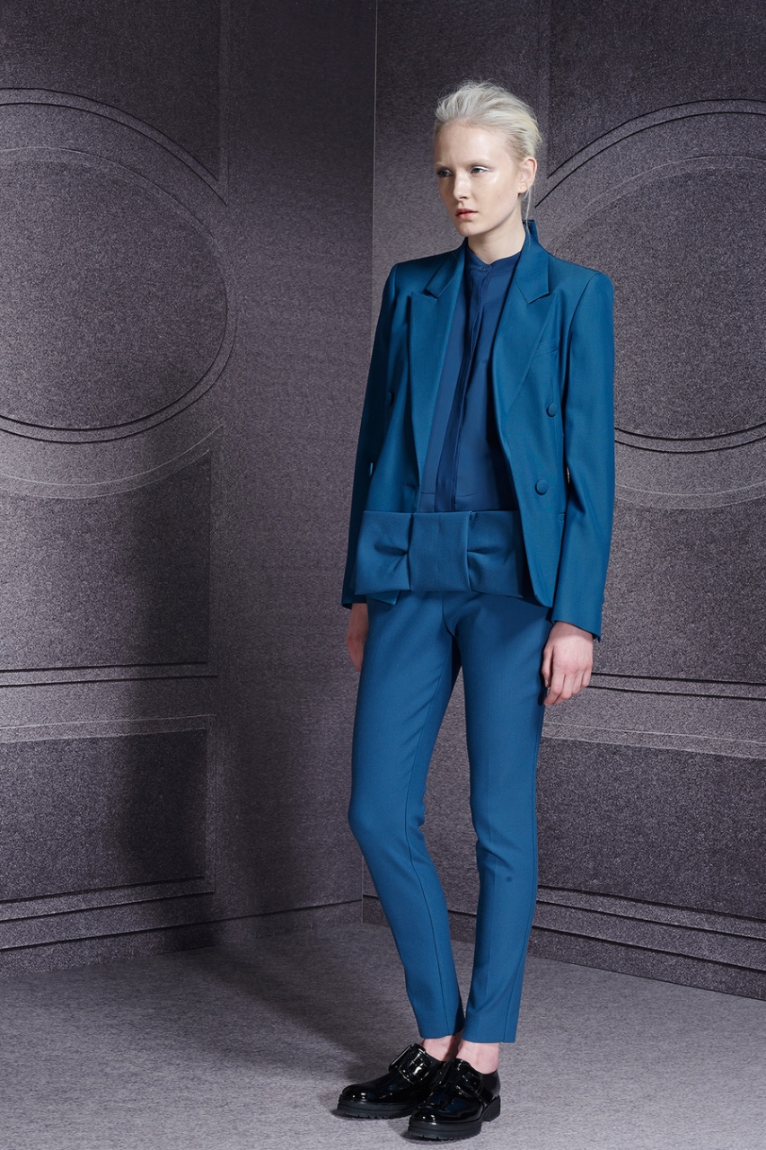
Although this seemingly primitive geometry also works in the theory of color types. For example, I am summer, I wear pink where at G=0, B > R/2 (cold), the one where B < R/2 мне уже не идет. А моя подруга-весна носит наоборот розовый где при G=0, B < R/2 (тёплый).
It’s true that she also chooses more saturated colors, where G is really close or equal to zero, and I choose paler colors, where G > 0, and accordingly B is calculated differently there (by the way, I don’t understand how, if anyone tells me, I will grateful).
In general, I simply urge that if you are going to talk publicly about colors “from a scientific point of view,” then please use the terms correctly! That's all. Otherwise there is enough confusion here as it is. Soon the concepts “warm” and “cold” will lose all meaning at all, because everyone considers it correct to mean by them what seems convenient to him personally.
Why then use these terms at all, if everyone puts into them what they “personally see”? Let me then call the yellow color “tram”, why not?
P.S.
I re-read it. Somehow I got a tone here, like Bozena’s - “The Sound and the Fury” :)
Or how I recently came across a post by a user completely unfamiliar to me (I was searching for some information and really ended up there quite by accident), who, with inhuman hatred, spat and swore at... shoes with cork stilettos. (Well, that is, the pin itself, of course, is not made of cork, it is simply covered with material “like cork”).
She used these words to call these shoes, as if these cork stilettos had been stuck in her heart. (By the way, I think cork stilettos are very cool, but okay, we’re not talking about them.)
I read these curses and was happy for the person: after all, if some unfortunate shoes cause such violent emotions in her, then this probably means that everything else in her life is full of harmony and grace.
So I got something similar here.
Well, in general, I wanted to say that “sound and fury” happened by accident. Sorry!
I really get annoyed when people use words as they please, but just in the case of “warm” and “cool” colors - I understand where this tradition comes from and even quite understand what people want to say when these terms are used incorrectly, Therefore, in general, emotionality has neither the village nor the city.
I probably shouldn’t have put these topics together into one post, but I’m certainly too lazy to edit anything right now, so I’ll post it as is.
As mentioned earlier, colors have three characteristics - one of each pair: warm-cold, soft-bright, light-saturated. Today we will focus on distinguishing between warm and cold colors.

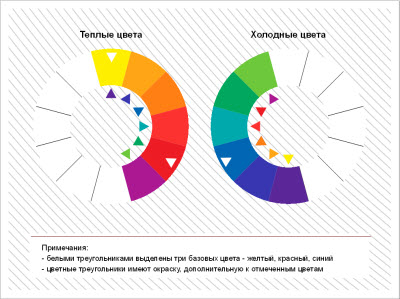
First, let's deal with chromatic colors. For clarity, look at the color wheel again:

As you remember, all chromatic colors can be composed of three primary colors: red, yellow and blue.
Red and yellow are psychologically perceived by us as warm colors because they are associated with fire and the sun.

Blue is psychologically perceived by us as a cold color because it is associated with cold and ice.

Accordingly, those colors in which red and yellow predominate are considered warm (orange, red, yellow), those in which blue predominates (blue, cyan, lilac) are considered cold.
Those colors that contain equal amounts of warm and cool (green = yellow + blue, purple = blue + red) are generally considered neutral.
Now let's return to the fact that all secondary and tertiary colors consist of two chromatic colors in different proportions (when adding a third, a gray tint appears, but we won't go into that for now). The color that prevails usually determines the color, tone (overtone).
However, in color design, another color that is part of the shade is also important. This color is called halftone. Halftones make colors within the same hue “warm” and “cool.” For example, warm red and cool red. Cold halftones - blue. Warm undertones - yellow and red. Orange does not have cold undertones - it is the only absolutely warm color.
Here are examples of warm and cool shades of the same color:
The first column is warm halftones, the second is cold halftones.

Usually, when talking about color combinations, colors with the same undertone are combined. In the theory of color types, cold and warm colors refer to colors with cold and warm undertones.
General rules for combining colors depending on the undertone:
Colors with the same undertone go well together. Colors with different undertones do not combine well, however, in clothes they can sometimes be combined in small quantities to create accents.
Compare:
1 picture - cold purple (half-tone blue) + cold green (half-tone blue) - harmonious
Picture 2 - cold violet (blue half-tone) + warm green (yellow half-tone) - disharmony.

In nature, colors are usually combined with one halftone.
Cold halftones: cold blue, light blue, cold bright red, burgundy, cold green, light gray;

Warm undertones: warm yellow, yellow-orange, red clay, warm green, olive, marsh.

Now regarding achromatic colors: pure white, gray and sulfur are considered cool colors and, accordingly, harmonize well with cool colors.

Medium gray sometimes acts as a neutral color if it does not have any blue or yellow impurities.
We invite you to practice distinguishing between warm and cool undertones: first, let's compare the colors with the warm and cool undertones in the photographs below.


Now that we have examples before our eyes, it will be easier for us to make warm and cold versions of the same color ourselves using gouache. We take jars of neutral paints (remember that orange is always warm) and, adding a drop of blue pigment or yellow, we create colors with cold and warm undertones. In this way, our eye will gradually learn to capture color nuances, and we will be able to create harmonious color compositions in the interior, clothes - in anything.
After you have determined your color type of appearance and have acquired theoretical knowledge about the color schemes that suit you, you should learn how to divide shades into warm and cold.
Many of us do not have an artistic education and at first glance are not ready to determine whether a shade is warm or cold.
There are many illustrations on the Internet that show the separation of colors by temperature.


But most of them show only pure colors, which are not so abundant in nature.
Separating colors too roughly will only confuse you. And such pictures will generally form an erroneous idea about colors, because it is wrong to think that the red-orange range is warm colors, and the blue-green range is cold.

How can you learn to determine color temperature?
First, you must understand that colors constantly flow into one another. That, for example, the color red can have both warm and cold shades.
Pure colors can only be found in pictures. In clothing, mixed colors, more complex and deep, are much more often used.
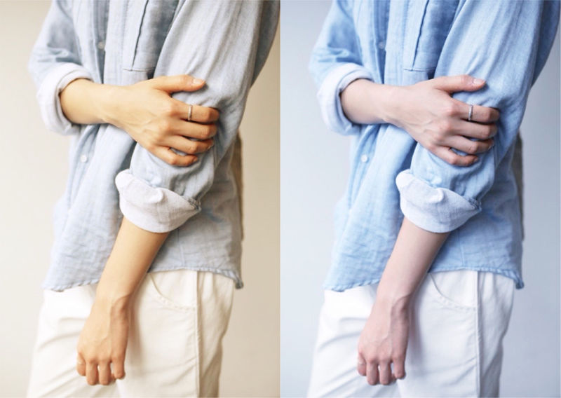
Compare these two shades of blue:

In the first picture, the blue is deeper and more saturated and does not have a white pigment, unlike the second picture, which really smells cold.
About any color, for example, cool purple, you can say “this shade is colder than the other.” Look at these two outfits. In the first photo there is more white pigment and the fabric itself gives the image a cooler tone.

Take a look at the red colors:

These examples show more clearly where the color is cold and where it is warm.
Basically, warm or cold undertones are given by the following shades:
Make the color warm: red, canary yellow or orange.
Cool: white, gray, blue, blue, black or lemon yellow.
When you have an outfit in front of you, for example, green, you shouldn’t immediately remember what color it belongs to. Try to see other shades in it. The first is cold, the second is warm.


Second example of green images:


The first is clearly warmer than the second. We hope you are already able to determine the color temperature.
But don't worry if it's difficult right away. All comes with experience.
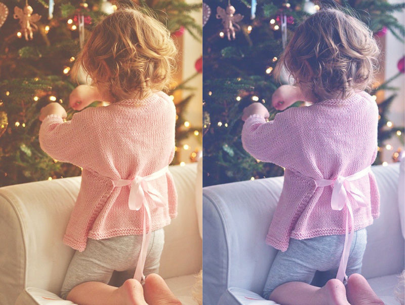
Example of purple color:

As you can see, in the first photo the purple is diluted with a red tint, which immediately fills the color with warmth.
So don’t roughly separate colors and think that, for example, if you have a warm color type, blue doesn’t suit you. Just choose shades of blue with warm undertones. For cold color types it’s even simpler; you just need to whiten the warm color with white or darken it with black.
The material can also impart temperature to the color. Matte, suede fabrics add warmth, while shiny fabrics make colors cooler.
Cool and warm colors of paints, when combined correctly, give stunning results. With the right design, you can create a stylish and unique room. Moreover, everything can be done with your own hands and without outside help. Especially if you are a creative person and an extraordinary person.
Below you will receive all the necessary recommendations on this issue, and the photos and videos in this article will present ready-made design solutions from professionals.
Everyone knows that the color scheme is divided into three main types:
Attention: The room will look much larger and wider if cold and warm colors are used in its interior.
- Visually, they will increase the height of the ceiling, and the walls will appear widely spaced. Correctly selected colors act as magicians who create real miracles, however, not everyone can do such a miracle.
- In order to correctly observe all color combinations and visually enlarge the space, the best solution for you will be the help provided by professionals in their field - stylists and designers, and the instructions outlined below can also help with this.
Before you start changing the interior of a room or house as a whole, you need to familiarize yourself with the color palette, which contains all the shades of cold and warm colors.
Walls and ceiling
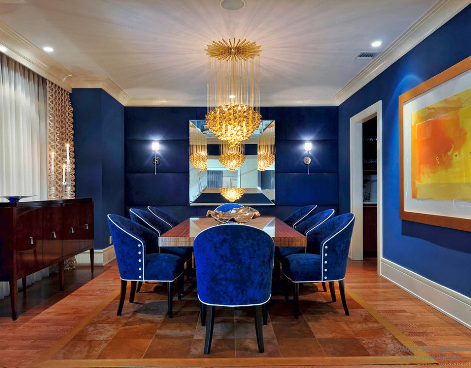
Professionals for residential interiors recommend using warmer and more delicate shades in combination with soft cold tones that do not excite the central nervous system and are well perceived by the human eye in optimal lighting.
For more open and bold people, the color scheme can be represented by quite bold colors. You can vary cold shades and combine them with more contrasting warm ones, all this will bring more brightness and richness to the mood, and will also make the room visually larger and increase the height of the ceilings:

The following combinations are also perfect: beige shades on the walls, one of which is dark. Pure white floor and mirrored ceiling, bluish tint of the walls combined with blue furniture.

Another option is to keep the interior in only one color, but at the same time use its different shades - deep blue, light turquoise, sky blue
The use of bright colors, among which there is a peaceful and light color, brings some zest or mystery to the interior.

Decor in furniture
Below is a way to, for example, make a calm room look more youthful and vibrant:
- Use cream and white shades as the base color.
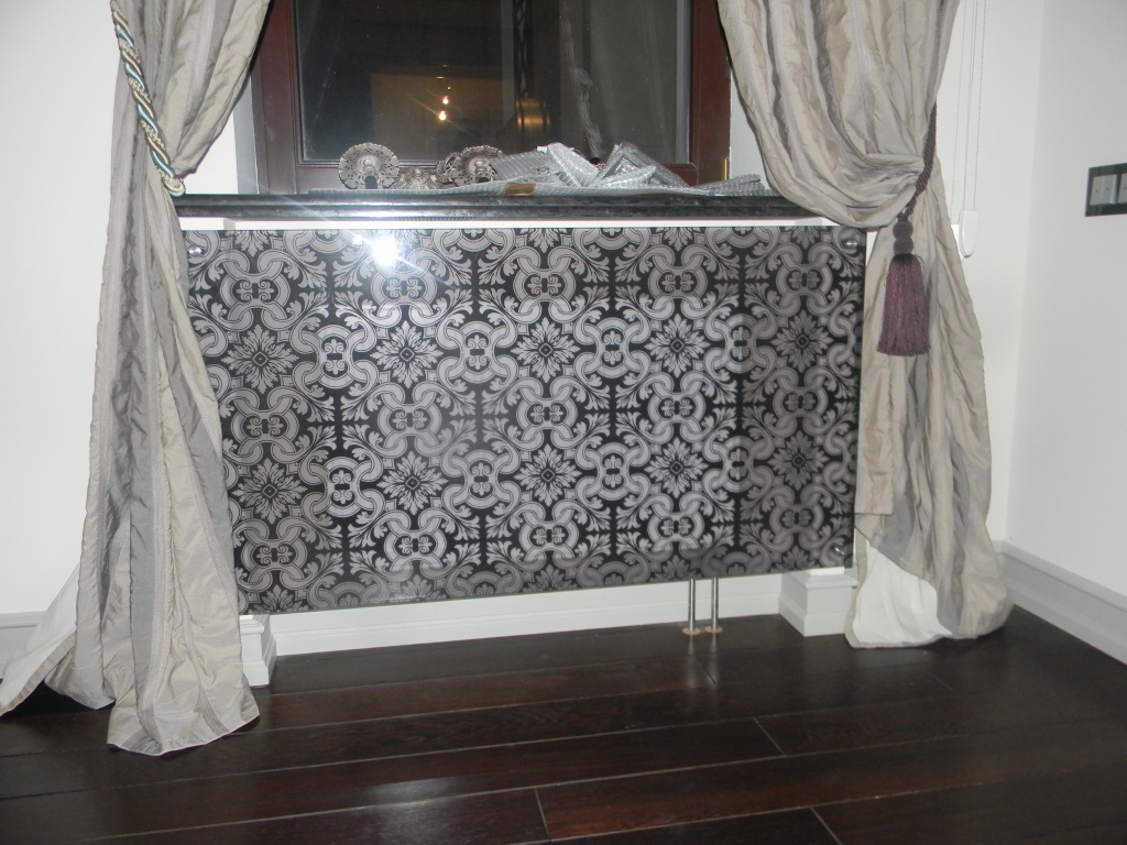
- Include colorful elements, for example, for batteries and all kinds of metal fittings, use cool-colored paint - black, red, etc.
- In furniture upholstery and textiles also use saturated colors, these can be purely cold tones. Or you can dilute it with a slightly warm shade.
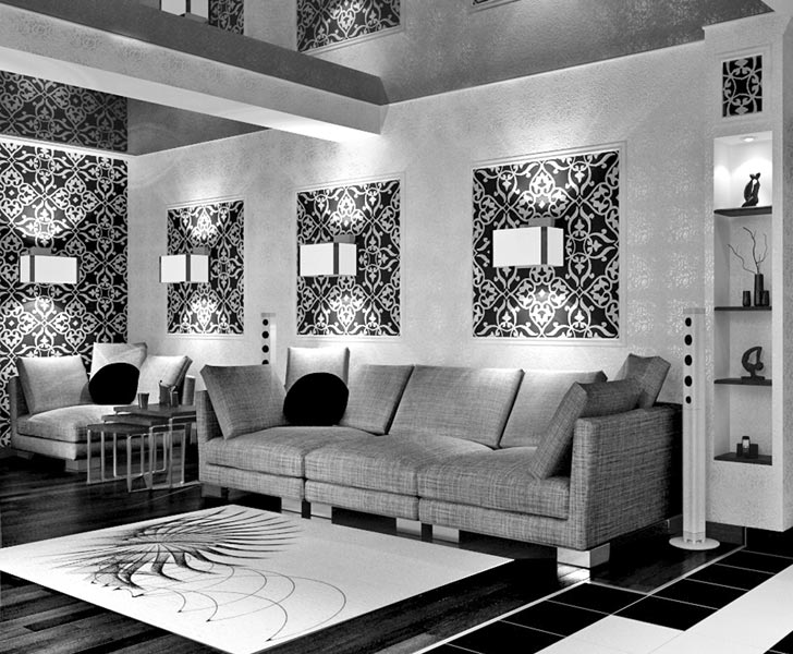
- Make one of the walls bright and artsy, while others are soft and calm, this can be either zoning or drawing attention to individual elements of the interior.

Attention: The most important thing is that when changing the color scheme, follow your true desires, do exactly what you personally want, and not what is fashionable, etc.
To paint metal surfaces, use specialized paints that have fire-retardant properties. Polystyrene, which protects against rust and other defects.
Interior: external and internal
If you plan to carry out not only internal renovations, but also external ones, then choose a style in advance and only then start buying paint. The outside of the interior can be decorated with panels, wood, brick, or cool tones of paint can be used for doors and other exterior details.

If you want to make some kind of emphasis on the facade, then feel free to use cold, saturated shades, they will look bright and colorful, but inside it can have the opposite effect.

Interior decoration has its own characteristics, which are better to adhere to, as they can reduce costs and require less time to work.
Each room has its own mood
Cool and warm paint colors should be used together. After all, a correctly selected color palette plays a huge role in interior design. Color can either ruin everything or, on the contrary, make everything better. It can relax, inspire, excite, etc.
If you are decorating an apartment, then for each individual room you need to use different shades:
- In the dining room or kitchen (see), warm and light colors will look great, for example, cream will look like cream, light green with fresh herbs. In this zone, the color palette should fill and energize, because in the kitchen we feed our body with food, which will be much more pleasant to eat in pleasant, cozy shades.

- To prevent the room from seeming boring, the monotony should be diluted with bright paintings or decorative items. You can also give preference to natural shades that will give a feeling of warmth and comfort.
- Warm and soft tones are perfect for the bedroom (see) with a small addition of cold shades. Photo wallpapers, all kinds of paintings and panels that will dilute the pleasant and delicate shades of the room would also be appropriate here.

All other rooms can be completed based on personal preferences, but of course taking into account the overall situation. If you are completely confused about colors and don’t understand what is best for a particular room, use the services of a designer. The cost of a professional’s work is quite high, but the result obtained is worth the cost.
Cool colors of paint in combination with warm ones can be present in any room. Almost everything can be done with your own hands and then the price will not be significant. There are instructions, all you have to do is make your choice.